CAPTAIN AMERICA CORPS #2 (OF 5)
What did the
iFanboy
community think?
Pulls

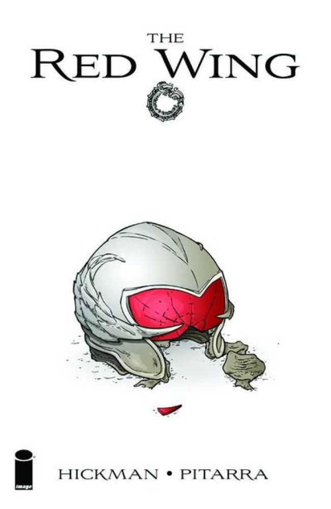
art & cover NICK PITARRA & RACHELLE ROSENBERG
Size: pages
Price: 3.50
When Jonathan Hickman has a story in mind, you pay attention to it. That’s what I’ve learned ever since I got involved with his work. Why Marvel would let him go back to Image to tell a creator owned story, we’ll never know. But the fact that we have a story by Hickman, practically unfiltered and raw, should be worthwhiled. Plus you have this relative newcomer artist with Nick Pitarra who has a style I can get behind. So what has the mad genius has to offer us this time?
I am a big fan of time travel stories so Hickman already has me hooked. What Hickman is really good at I’ve noticed is that he can suck you into a story even if you have no idea what’s going on. We start the story off with a seemingly unrelated moment of a ‘red wing’ disintegrating into dust. Then we finally get to the story of a group of young men joining a ‘time travel military’ to get into a war with a group of elements. That’s all we really get in this issue and while it doesn’t give us too much to work with, I was intrigued to continue. Especially with the ‘lost in time’ element Hickman adds to the end which totally brings a lot of intrigue for future issues.
Looking at Nick Pitarra’s art and you could totally see Seth Fisher in his style. The page of the ‘Red Wing’ soldier turning into dust totally screams ‘Fisher’ and so does the final page with the landscapes of the past world the soldier stumbles across. But there is also an early Frank Quitely style to his pencils. It isn’t what you would get in a Quitely book now, more like from ‘The Scottish Connection’ Batman story he did long ago. (That’s in a trade called Batman International and I recommend that if anyone is interested) You can see that early style in the faces Pitarra draws, especially when you only see the chins of characters in the ‘Red Wings’. Enough of what he looks like though, Pitarra does bring a lot more to the table. The opening panels of a Dinosaur age, or soldiers fighting aliens look really good. Plus Pitarra adds a lot of unique panel layouts to the story, like when the solider crashes his ‘Red Wing’ in a forest. One criticism I do have of the art is the muddy colors colorist Rachelle Rosenberg brings. The colors are too muted for my taste and I think it kinda ‘smush’ the pencils Pitarra has on the page. It’s not a complete deal breaker but the colors in this are pretty disappointing.
Weak coloring aside I am on board for this mini. Hickman has some freaky time travel story brewing and I’m all for anything time travel related. Add the wonderful pencils by Nick Pitarra and I think Image has a great new artist on board if they can keep him. Some might not like how quick the story reads but I found myself wanting more.
Art: 4 - Very Good


Leave a Comment
Login or Register to get involved and leave a comment