BATMAN RETURN OF BRUCE WAYNE #4 (OF 6)
What did the
iFanboy
community think?
Pulls

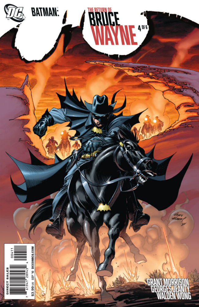
Art by GEORGES JEANTY
Cover by ANDY KUBERT
Variant cover by CAMERON STEWART
Size: 40 pages
Price: 3.99
The Western has certainly tried to get back into the mainstream audience. With several films and a successful video game released; I’m starting to enjoy the genre more then ever before. So to my delight Grant Morrison’s next chapter in the return of Bruce Wayne takes place in the wild west. Not only that but we have the inclusion of DC’s resident badass bounty hunter Jonah Hex to (possibly) be the foil. How can it go wrong!?
Reading the issue and you’ll see how badly it went wrong…
I don’t know what is going on with this series and Grant Morrison. While Morrison has killed it with ‘Batman and Robin’ recently, this epic return has been anything but. Sure the cavemen issue was good and so was the pirate issue; but it didn’t really have that Morrison charm I come to love. With this issue….I just don’t know where to start. I’ve read this thing a good 2-3 times (as I normally due with Morrison books) and it’s just all bad. Not like ‘I’m so confused with this’ bad, I mean ‘this is poorly written bad’. If there is one genre Morrison can’t do, and definitely after reading this, it’s Westerns. Nothing really feels like I’m in the 1800s, and you could easily think these are just actors pretending to be in the old west. What I mean by that is, nothing feels natural about this. Again with the pirate issue; Morrison wrote the hell out of that and made the speech feel natural. Here it feels forced and it’s like Morrison wasn’t even trying.
Now that I’m a HUGE fan of Palmiotti and Gray’s ‘Jonah Hex’ I was so excited to see Morrison take a stab at him. But if you’re going to do Hex then you better know what you’re doing. He’s basically reduced to a background character the ENTIRE issue. So instead of really getting a sense of a gritty and grim character, I just get like a very special cameo like a TV show. The entire plot itself is pretty boring in itself and having Bruce say nothing the entire time is pretty weird. Oh and I’m gonna go out on a limb and say: The Thomas Wayne we see here is Dr. Hurt now. Considering Morrison lays a pretty obvious clue towards the end, it makes the most sense.
So the story isn’t good on any level. The art has to be good right? I mean Morrison got his hands full with some quality talent…..Then Stewart decided to drop out at the last second and we are forced to look at Georges Jeanty art. Look, I’ve never read an issue of Buffy nor have I’ve seen anything else Jeanty has done. As a first time viewer of his art, it’s a really bad first impression. I mean a REALLY BAD, first impression. Everything looks rushed (which is understandable since Jeanty had little time to do this) and ugly all rolled in one. There’s not a single panel in this where I didn’t wince at something truly awful. The panel layouts themselves are pretty piss poor and the flow from one to the next is confusing. If there is a character in the background, no matter what the mood is, they are all smiling. There are even characters that look like they’re in an anime at points. (Big heads and HUGE eyes) Going back to Hex for a sec, again you better get him right if you have any justice of putting him in the book. I don’t even know some of the artists in the first two trades of Jonah Hex….but they are one-hundred times better then what Jeanty brings to the table. I curse Cameron Stewart for bringing blight to this issue! I know that’s probably a bit much, but seriously, if he were to at least pencil the issue this might have been salvagable.
There’s no ways about it: Return of Bruce Wayne #4 is easily the worst issue to date of this mini. In fact it could be the worst single issue Morrison has even worked on. Batman and Robin #4-6 (easily his weakest arc on that series) had better stuff going for it then this. When you add in Georges Jeanty horrible artwork, you got yourself one shitpile of a comic. I really hope Morrison brings back his game for the fifth issue. Not sure who the next artist is at the moment, but he better bring his ‘A’ game too. At any rate, you can’t get worse then this.
Art: 1 - Poor


I haven’t read this issue yet….i’ve only seen the previews online, but i think you’re assessment of the art is a bit harsh. Sure there is accounting for taste, but i don’t think the work is cringe worthy from what i’ve seen. The Draftsmanship seems competent and sure his style is a bit more cartoon-y than might be appropriate for the series, I doesn’t appear as awful as you suggest.
I don’t see any of the blatant anatomy issues that Frazier Irving had in his book…..i.e. inconsistent character rendering, the heads looking out of proportion and some bodies looking broken. etc?
In the end its about taste i guess.
@ wallythegreenmonster No, this Was horrible.
"Nothing really feels like I’m in the 1800s, and you could easily think these are just actors pretending to be in the old west."
Hm. Well you do realize that many of the important characters in this issue are all beings who are somewhat "out of time", right? It’s not just Bruce, who is obviously jumping around in time, but also Dr. Hurt/Thomas Wayne is more a man of the 1700s than the 1800s. And Monsieur Sauvage is actually Vandal Savage, so I wouldn’t expect him to talk or behave like a nineteenth-century man either. Then you have a somewhat enlightened Native American and a girl (Catherine) who’s in a drug-trance most of the issue. There isn’t any cowboy-talk coming from any of those characters, but once you take into account who they actually are, of course there wouldn’t be.
I did think the issue felt a little "off" in places. The casino atmosphere wasn’t played up as much as I would have liked it to be. But the opening sequence was classic Western, as was the stagecoach chase toward the end. Yeah, Bruce doesn’t talk, but that’s a well-established Western trope going back a long time: the dark goodguy stranger who doesn’t talk much. It’s pure Clint Eastwood Man-With-No-Name.
The worst issue of this series? Yeah, probably. But I didn’t think it was bad at all. The art was decent–good in some spots, spotty in others. I really thought the visuals were fantastic during the opening sequence and the sequence near the bridge. And so many mystery-plots were furthered by Morrison in this issue. All the stuff with the casket and Dr. Hurt (Did you notice that he took the S.S. Orion?). And Alan Wayne’s narrative boxes were filled with BEAUTIFUL prose–I can’t see how that would warrant a "1" in the writing dept, but that’s just me. (Alan Wayne isn’t named, but that’s who the guy they meet on the bridge really is; he was the architect of Wayne Manor, mentioned in the previous B&R arc; here we see him oversee the "W" and bat-symbol built into the foundation.)
I’d say the art was a 3. The writing was bad as a stand alone issue, but was clearly setting up the next 2 issues. I’d probably still give it a 2 just because he used Hex and Savage so poorly.
"If there is one genre Morrison can’t do, and definitely after reading this, it’s Westerns. Nothing really feels like I’m in the 1800s, and you could easily think these are just actors pretending to be in the old west."
I’m very highly confused in what you were expecting in terms of dialog. Expecting to here characters say "Hooo boy, them cattle rustlin’ sure was a kick in the spurs today!" This sounds like typical criticism from someone who thinks that everyone in these stories speaks like John Wayne, Alan Ladd or Gene Autry. Watch some spaghetti westerns, or even ANYONE starring Clint Eastwood. Listen to the dialog. It’s typical American. Sure, there are a few affects here and there, but it’s nothing radically different. Don’t expect the Wild Bill Show in your western stories, because THAT isn’t good, and just as hokey as it was back then.
I wish this issue was a bit longer so that they could develop this aspect, but Bruce Wayne is the archetype of the spaghetti nililistic hero. Silent and amoral because of their tendancy to kill, but still a weirdly shining star in a world of absolute filth. And what filth was in this issue! That opening scene was classic spaghetti western. Gritty, dirty, violent, and utterly nilihistic. Morrison doesn’t know westerns? This is proof that Morrison gets the basic elements of what makes GREAT westerns! Now I’m not calling THIS issue a great one per se, but it contained the right atmosphere and had all the right set ups. Morrison gets what these westerns were supposed to be: an enema to a classic yet safe genre. So if you’re saying that this isn’t anything like the western genre because you associate it strictly with movies like Stagecoach and The Magnificent Seven, then go watch The Great Silence. Watch Django. Watch ANY Leone. Your view of westerns will expand more.
I’m not going to defend the art, because it was average. But it certainly wasn’t terrible. However, reading on Twitter how you were bitching and moaning about how Cameron Stewart dropped off the project and were saying, even before the preview pages came out, how "This is probably going to be rushed!", you were obviously going into this already hating it. Look, Stewart is one of my favorite artists of all time, but fucking let it go. He’ll work on other books.
You are so right, @Champeen. To quote you, if I could’ve given it a zero, I’d’ve done just that.
This review seems to have a biased view to it, and I have to say I very much disagree with most of the reviewers opinions. Art terrible?? I think thats ridiculous why its not amazing art by any means it worked with the issue and was pretty good, def not terrible. I agree that I probably enjoyed it the least of any issue of this series, but I feel its still a entertaining read that I enjoyed and I really enjoy that savage is in the issue and thomas wayne, or maybe hurt? Also showing Alan Wayne and the building of the wayne mansion was also very interesting. I agree with froggulper that Alans dialogue boxes were very well written as was most of the issue. I Feel the reviewer seemed to already of an idea of how he wanted this issue to be not only with the western aspects but with stewart dropping out on art, also he had problems with Hex not being involved the way He expected him to be. In my opinion horrible review. A review should be a non biased view about the actual issue being reviewed. This was a response from a writer who obviously had his own ideas and opinions about this issue before it was even released, and therefore turned it from a review to a forum for him to share his many complaints about the issue. I think the issue is well written, not as well as the previous issues, but still is good read. And the art is not cameron stewart, which is what the writer wanted and obvisouly was not open to a replacment, but the art is pretty good overall. If I were to give it a grade I would give it a B – Next time I hope you publish a different writers review or this guy decides to let go of what he thinks an issue should be and go into a read with an open mind. I think he would probably enjoy his comic experience more.
Absolutely agree – the art was abysmal.
Reading it I didn’t noticed anything too bad about the art but I was really just trying to get through the terrible story.
I totally agree with every word of this review. I feel like this issue is the biggest disappointment of a comic that I’ve read in the last year.