BATMAN JOKERS ASYLUM TP
What did the
iFanboy
community think?
Pulls

Size: pages
Price: 14.99
This review contains spoilers, click here to read
*White Rabbit by the Jefferson Airplane is played in a loop and it's a not so hot day but it still manages to dry my throat and make me swelter*
A pretty thin TP that collects: The Joker's Wild!, He Who Laughs Last...!, Deflowered!, Dark Knight of the Scarecrow, and Two-Face, Too.
The cover is cut shorter than the pages so the pages stick out but it's a small gap.
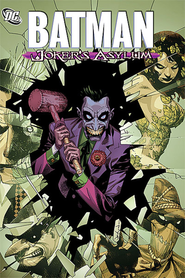
I didn't like the cover at first - the nakedness of Ivy plus her giant breasts, the very purple face of the Joker - but it grew on me over time (but I'm still not too sure about the Joker's purple face).
It's a collection of one-shots where the Joker addresses the reader and introduces them to the major Batman villains - the Joker, the Penguin, Poison Ivy, the Scarecrow, Two-Face.
It's mainly an introduction to characters but it isn't developed further which is weird - I guess it's meant as an introduction for beginning readers, and that DC intends the already existing Batman and Batman related TPs and issues to be the main story itself.
What I mean is - some stories are a very basic introductions to the psyche of the characters, without showing us a full story - like the character information in the beginning of playbooks, without getting the play itself.
The Joker is in Arkham Asylum which is basically a place for lunatics, and he tells his stories from his cell - but not in a realistic way - the setting of his cell changes with accordance to the story - like in the Poison Ivy story where plants start growing in his cell. (correction: he starts in his cell but changes locations to better fit the story).
The first story is about the Joker - he breaks into a TV station during a live broadcast of a game show, takes over the station and has his very short fun where he barely does anything.
It's a crude way to introduce the notion that the Joker isn't the only bad guy in Gotham and that the rest of the people are to blame as well - since it's broadcast live (very unlikely in the real world) and many people tune in to watch it, they are to blame as well - for enjoying the Joker's horror show.
The quick answer to the Joker's assumption is "no, they are not".
That notion is shoved down our throats, but whoever decided that the writer only gets one issue to tell the story holds partial blame.
This story needed to slowly drip the notion to the readers' minds without boldly stating it like it did - but one short issue leaves no room for subtlety so it's in-your-face and crude which makes it very hard to accept.
Because it couldn't be done subtly, the story should have been replaced to something less common that fits more into the "one short issue" format DC chose.
The drawing style is rough and hand made and reminds me of the drawing style in the Lobo TP "Portrait of a Bastich" - crude and rough, doesn't pay attention to correct anatomy - the Joker's face changes in each panel (he looks like a completely different person each time) and people have too many details on their faces that make them look like their skin is peeling.
Without that abundance in detail the Joker could've looked realistic and very scary because his facial expressions make him look loony and creepy.
All throughout the TP the Joker's lettering is drawn in italic and look more hand-made - more rough (allowing mistakes to be made - like the F being written "-F" meaning the line continues which might happen when people write manually) and they are written in a wave pattern, and some have a purple streak behind them. It's a nice addition but I don't get it - it would've been better if they focused on the actual words to create effect instead of lettering tricks - the consistency of that lettering cancels any effect it has - it would've been better if a regular comics font would have been used with bolding some of it, and that the font would have changed for one or several words out of the blue - it would have created a greater effect instead of the regular wavy and hand-written look with weird purple streaks that I don't understand - was is meant to show that those words were bolded without bolding them? I have no idea.
The second story is with the Penguin - there's an evident use of the computer in the drawing and there is panel recycling but it isn't excessive, and the story is very simple - we see the Penguin as a fat and very short and ugly kid being rejected by girls and being played mean tricks on so he decides to get back at those girls and he does, but they get him back eventually.
His connection to birds is shown here in a crude manner, we see that he likes to take revenge on people because of stupid things like people laughing while looking at his general direction (he thinks they are laughing at him) - he slowly ruins their life in an elaborate and sinister way.
It needed more issues to tell the story - the victims didn't interest me because we knew nothing further than what the Penguin did to them, and the main victim (that the Penguin eventually puts back where he found her) doesn't interest me at all.
Also we don't get much info about that place where he found her and returned her to - is it a place where people are being sold to be sex slaves? Are they being sold for rich people to execute their fantasies and sexual fantasies upon with no fear of retribution?
Are those women ones that no-one will look for or that were sold or kidnapped? Also buying them "second-hand" without getting their hands dirty might protect them from getting linked to that place.
What is that place? I have no idea, but a simple "it's a X" would have made me care more for the main victim - just a little bit more, but it would have been better than nothing. Maybe there was and I missed it...
The drawing is good and dynamic and transfers a lot of detail to the reader by using people's facial expressions or where they are situated compared to other people.
For instance: Panel 1: We see the Penguin as a happy kid reading a book about birds in some big bird cage with lots of pigeons.
Panel 2: We see the three girls he took revenge upon charging towards the reader with baseball bats.
Panel 3: We see one of those girls hitting the Penguin in the head and we see the force of the blow - the other girls and the environment aren't visible (just the Penguin and that one girl).
Panel 4: We see the three girls but not the Penguin but we know they're hitting him - two girls hit him and the third is about to hit him.
Panel 5: We see one of the girls throw the bat away - we see the bat in the air, and her hand in a throwing motion.
Panel 6: The three girls are black figures in the distance, and we see the Penguin on the floor feeling his aching head and he has one bat beside him, but the scene isn't as graphic as I would expect.
It's a quick way to show us what the characters do and feel without showing too much or too little - great layouts.
In the third part we see Poison Ivy and get some information about her beginning which is interesting and makes me want to read more comics with her, and we see that she's smart and cunning and a worthy adversary to Batman.
The drawing is too dark for me and colored too evenly for my tastes (no shade changes) and too many one color coloring of some of the characters which is something I hate - when characters are close to the reader they're sometimes colored on one color - usually purple or red (I don't understand the reasoning behind that method).
The drawing is coarse - like the panel of Batman sitting without his mask, but despite those there are some great drawings as well - the drawing is pretty good but not to my liking and it would've been nice if it was a bit more realistic - if the coloring of some of the things was changed.
The part where they show Poison Ivy dissecting someone is great - it is done pretty kid-friendly and looks like someone cut a photo - a great way to show something horrific like slowly killing someone by cutting him from toe to head with an ax, without making it too graphic.
There is obvious computer use in the drawing - like in a yellow DO NOT CROSS police tape, and the lettering, but it doesn't bother me.
There is a nice thing done when Poison Ivy narrates - the text is in a rectangle with pretty thick black border, yellow background and green letters.
There's a great drawing of her - after we see Gordon and Batman talking in the golf course, there is a panel with part of her face. Her hair invades the rest of the panels like a climber plant, she has leaves in her hair that are partly brown and partly green - adding them is a nice touch, and the coloring makes it look pretty realistic and great looking.
This is the only story I liked.
It gives info about her past - that she was fooled and abused - used as a guinea pig for some experiment, and that she slowly started discovering her powers and that with them she started to feel the huge pain plants feel because humans kill them to make way for more concrete jungles, so she decided to avenge them.
In one panel in the end it was a little hard for me to understand what happened to the Joker's hand after it was eaten by a plant, but after reading the entire page it's clear that it's a fake stump (it looks pretty weird).
There are of course stupid things but they didn't bother me - she has giant breasts, she walks around totally naked for several panels in the woods with the usual "Adam & Eve" method of concealing the "naughty" bits which is childish (oh well), and the cover is like the poster for the film American Beauty but with leaves instead of flowers etc.
The fourth part is with Scarecrow - he tries to teach a girl that is being bullied and picked-on and that is about to be the victim of a nasty prank, the meaning of fear and how to overcome it.
The text is very predictable, boring and generic - text that is overused but gets a bit better as the story progresses.
The drawing is nice but is 100% (or close to it) done in the computer and there are no outlines and there are barely any lines - there's mainly color and the drawing style is a bit angular - like the noses, feet and hands.
I have no problem with this style for pictures or a short strip, but this is too much for me, but I tried to lessen my disliking and just look at the art and I saw some nice panels - like when we see Batman and there are a lot of bats around him.
The coloring is very uniform - one color for human skin, one color for ... etc, and the shading is done using the computer - darkening the existing color by several shades, and it makes it look like a 3D computer game a bit and gives it an element of fakeness.
There seems to be a use of photos - like a toilet that looks like someone took a photo and photoshopped it a bit, and there is a photo of Batman's symbol that was added to a notebook with many drawings on it, and it clashes with the drawings.
*I'm not so sweltering anymore and I edit and re-edit this so I got sick and switched to Rebel Yell by Billy Idol*
The fifth and final part is with Two-Face.
The Joker here looks very realistic which is nice, the use of the computer is evident - in the coloring, but the coloring is nice.
The story is very predictable - a firefighter that got half of his face burned much like Two-Face is brought to Arkham to speak with him to try to cure him.
That firefighter speaks with him and tells him how fortunate he was - Batman saved his life, his wife accepted him despite his deformation etc.
It's pretty obvious what will happen for the rest of the issue - Two-Face will escape and try to ruin his life, and he does.
Two-Face prepares a test for him - if he shoots Batman (who he apparently caught and has conveniently tied-up a few meters away) he will not burn his wife's face off, but it's obvious that that isn't Batman and that the real one will come crashing in, that the relationship between the firefighter and his wife will change after this ordeal, etc.
Also the plot falls victim to the one-shot format because the firefighter isn't built enough as a character for me to care about him, so the end falls flat and the entire purpose of the story gets ruined.
I can't recommend picking up this TP or any part of it in issues - this is a pass. You won't miss much.
*off to my record player since my computer needs the rest - Creedence Clearwater Revival probably, or the New York Rock & Roll Ensemble*
Art: 3 - Good


Interesting review. I like that you give very specific reasons for your dislike instead of just giving the anthology an "I didn’t like it sucks". Thank you for this. I’ll have to double check my issues but I doubt the Joker is meant to be in his cell in each story. If I remeber correctly he shows up in a backyard in the Scarcrow story. He is simply meant to be the narrator who conveniently appears where the writer needs him to be. If you’ve watched Tales From The Crypt you’ll notice they use the same technique of book ending each episode with the same character, just like in this series.
If you’re interested I also wrote some reviews for most of these issues. I didn’t review Two-Face but it was a great issue:
http://www.ifanboy.com/comics/dc_comics/jokers_asylum_the_joker/1
http://www.ifanboy.com/reviews/JumpingJupiter/dc_comics/jokers_asylum_the_penguin/1
http://www.ifanboy.com/comics/dc_comics/jokers_asylum_poison_ivy/1
http://www.ifanboy.com/comics/dc_comics/jokers_asylum_scarecrow/1
You’re welcome. You’re right – he changes locations. In the Poison Ivy story he’s in some greenhouse – I missed the glass ceiling, and in the Scarecrow story he starts at the girl’s house and ends up outside the cemetery.
It reminded me of the Tales From the Crypt format, but I couldn’t place it. I love those horror shows and movies. Are You Afraid of the Dark, even Goosebumps in some episodes were the cheesiness factor was reduced, and the Creepshow movie:
http://www.imdb.com/title/tt0083767/
There’s a similair format with old mythology (I think) and folktales but for kids which was sometimes scary – an old man and a talking dog introduced and ended the episodes. There’s a nice episode about a man that has no fear, and about a man that catches death in a sack and (spoilers) releases it when people get sick of living, but death never visits him again because he’s scared, so he’s doomed to age alone. Great concepts for a kid. I also read many collections of short horror stories about demon cats etc.
Now I want to see that TV show (don’t think I ever did – or I saw just several episodes or similair shows/movies) and read some horror comics. Thanks.
*Mother Lover by Adam Samberg and Justin Timberlake is played in a loop*
I added a correction. Thanks.
*off to brush my teeth and sing quietly/hum and even semi-dance if I’m in the mood*
*Andy Samberg