BATMAN AND ROBIN #26
What did the
iFanboy
community think?
Pulls

Art by GREG TOCCHINI
Cover by CHRIS BURNHAM
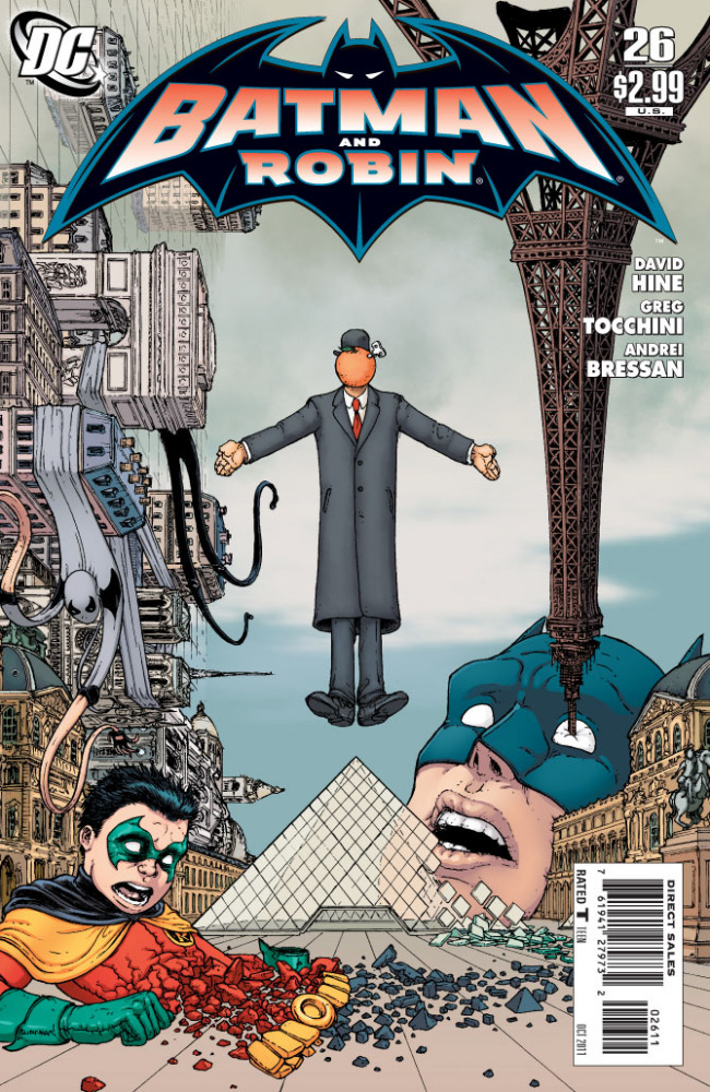
Variant cover by J.G. JONES
Size: 32 pages
Price: 2.99
Two things I want to express before I get to my review. First I think David Hine is a very underrated writer. I’ve enjoyed a lot of things he’s written for the past couple of years with the recently ended ‘Azrael’ series or the ‘Arkham Reborn’ storyline to name a few. He’s not the most perfect writer out there for DC but he gives out a lot of interesting ideas (some of them very dark) and for the most part each comic he works on is executed very well. It’s a shame more people don’t talk about him because he gets saddles to do ‘interm’ runs on books for other, high profile creators. (Like he did a short run on ‘Detective’ after Rucka/Williams III but before Snyder/Jock). Hopefully this issue will show people he can be suited for a bigger title in the future. The second thing I want to point out is that Greg Tocchini, easily the worst artist of 2011, is on this title. Which might hurt the fact that this was a very good comic to read but with horrible art to boot.
Let me explain a little further that last sentence. I very much enjoyed this comic from beginning to end on a story standpoint. You can just tell from the absolutely gorgeous Chris Burnham cover that this is gonna be a weird comic. That’s what you get when a bizarre mix of French supervillains break out and cause mayhem at the Louvre. ‘The Son of Man’ is the villain that caused this entire mess and judging from his constant narration, he has a few screws loose. So right off the bat you got a bizarre head villain with a mix of other interesting villains like ‘Sister Crystal’, who can turn people to glass or ‘Ray Man’ who’s like ‘Vertigo Man’ but much more fucked up. Pretty much this story is just a massive set piece with Batman, Robin, and Nightrunner (or as my Republican friends call him ‘Enemy’) fighting these baddies. It’s not the smartest story in the world but it’s a hell of a lot of fun to see these guys fight these guys and the end of it all is a true mind fuck. I thought Snyder was gonna give us something disturbing with the finale of ‘Detective’ this week but the end of this issue ends with the ‘Most Fucked Up Moment of 2011’ award for me.
The problem with this entire issue though is that the visuals has to balance the bizarre goings on of the issue. It doesn’t help that you have the ‘Worst Artist of 2011’ Greg Tocchini to do these visuals for you. (At least for the first fourteen pages) While there are shades of brilliance within these pages, like having a filmstrip on the edges of ‘The Son of Man’s’ flashbacks or the massive group of people fighting Damien, it’s all very rushed and uneven throughout. I mean look at the first page of this comic if it’s on you. Look at Dick at the bottom of the page: Just what the fuck is wrong with his mouth? It’s like he’s Freddy Kruger or at the very least a minor burn victim. Huge mistakes like that are peppered throughout the comic which almost destroys the ideas Hine puts into each page. Sometimes characters are standing the wrong way, or the flow of action between panels make no sense, or the fact of the matter is that some panels look downright unfinished. Again there are times where I am a bit impressed with how Tocchini somewhat puts Hine’s ideas on the page. But at the end of the day it looks grossly embarrassing that this is considered ‘A’ material for a big comic company. However, the final six pages are done by Andrei Bressan and it begs the question: Why the fuck couldn’t Bressan do these last four issues let alone the final one!? I’m sure these pages are rushed but the huge turn in quality goes up once his pages start. Hell his pages involve the most disturbing moments of the entire issue so big props for him for drawing a seriously fucked up ending. Makes no sense why he couldn’t do this issue….
So at the end of the day we have this going for the comic: Big ideas, good execution by the writer, but the art spoils everything. If Andrei Bressan did the entire issue, then I think this would’ve been a fantastic issue to end the first volume of Batman and Robin. Plus it would’ve done justice to the great script by David Hine. But sadly Greg Tocchini ruins the entire issue by his rushed and unfinished pencils for the majority of the book. Hopefully that man never gets a job again after this horrible run on the title. On the flip side, let’s hope we see a lot more David Hine in the future because he’s a name to look out for.
Art: 2 - Average


Good review, man. I’ve read some of Hine but am going to make sure I check out his work more in the future.
Thought about scooping this up but Tocchini’s art was painful. I put the book back on the shelf.
I’m a completionist and I’ll buy it, read it and put it in my little plastic bag… But yeah… Tocchini, come on damn it, how come he gets to draw on big shot titles like Batman and Robin or FF for Marvel!? This is beyond recognition, does the man PAY DC and Marvel to draw art for them? Seriously!? 0_o
complete balls. sloppy drawing. the story is great fun. i don’t know if i enjoyed the Hine stuff because the previous B&R stuff has been quite dreadful!
I like Tocchini. He has a great sense for form and composition and lavishes dynamism and energy into a panel. I like that his work ‘moves’ around the page more than conventional comic book fare. He reminds me a little of Mike Allred in as much as they both employ the discipline of using fewer lines; the right lines to get the job done.. Where they differ is Allred heads toward a cleaner line and Tocchini a more expressive one. GREAT issue.