BATMAN AND ROBIN #16
What did the
iFanboy
community think?
Pulls

Art by CAMERON STEWART, CHRIS BURNHAM & FRAZER IRVING
Color by ALEX SINCLAIR & FRAZER IRVING
Letterers by PATRICK BROSSEAU
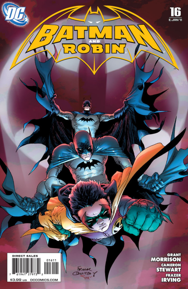
Cover by FRANK QUITELY
Variant cover by ETHAN VAN SCIVER
Size: 40 pages
Price: 3.99
A couple weeks back when issue #15 came out, I wrote a scathing review that critiqued upon how completely incomprehensible that issue was. While I can safely say that issue #16 was a much more satisfying and solid read, I still can’t help but feel disappointed by a few of the lingering questions that this issue leaves.
First off, let’s talk about the solid points of the issue. It does a really nice job of putting finishing touches on the role of the Black Glove, Thomas Wayne, and Dr. Hurt in relation to Bruce Wayne. I felt that Grant Morrison did an excellent job of tying those points together, and it definitely goes in a different direction than I ever would have imagined. The pacing of the issue was also superb, interspersing story elements while still delivering the action that’s needed for an event so catastrophic to Gotham. Ultimately, the issue leaves a satisfying resolution to story of Bruce Wayne vs. Dr. Hurt. Also, the moments with the Joker, like past issues, are excellent, and when Grant Morrison lays to bear the Joker’s true motivations, it’s definitely a crowd pleaser.
On the negative side, I still feels there’s lingering issues with exactly how Bruce Wayne came back. In both this issue and the last, he just magically appears. I acknowledge that these issues are probably addressed in some other book like The Return of Bruce Wayne or a one-shot, but it’s ultimately disappointing because it makes his appearance seem more random than it is satisfying. Also, as last issue seemed to indicate, both Dick and Damien seemed to be clued into Bruce’s return, yet there’s no indication as to how they knew or where that information was given. It’s this sort of thing that seems to make the issue more random than fully formed, but maybe in a few years when everything is collected, this won’t reveal itself to be too big of an issue.
On the art side of things, I was really impressed with this issues artistic look. Cameron Stewart completely nailed his pages, and I felt his style was more reflective of Frank Quietly than the traditional Stewart that we got in issues earlier in the series. There’s a roughness to his art in this one and the colors and inks add a little more texture to his more cartoony style. It’s a really nice look. While I’m not the biggest Irving fan in the world, I did really like the pages that he drew as I felt they complemented his style nicely. I particularly enjoyed the scenes with Pyg.
Overall, I felt that this issue was a lot more solid than last, and I can tell that like many of Morrison’s other stories, this is the part where everything comes together. It’s just too bad that I’m missing some pieces of the story, and in missing those pieces, I was drawn away from the impact of some of the moments in the issue.
Art: 4 - Very Good


This whole run from R.I.P./Final Crisis all through this series has been written as if it’s some huge jigsaw puzzle that will form a picture by the end. Now it’s done (?) it’s more like half the peices aren’t on the table.
It seems like most people are into this type of obtuse, surreal, disjointed, crazy-for-the-sake-of-crazy "story-telling", but I’m with you in the minority, shaking my head, wondering what the hell I just read.
Thank You Neb. I’m NOT reading any of the one shots OR the Return of Bruce Wayne mini and I like it when a person calls a spade a spade. If Morrison leaves out vital resolutions or major happenings because they occurred in other titles or timelines it leaves some reading out of the loop.