 Welcome to the third installment of Season One of #Tweetfolio Reviews!
If you’re new to this column and want to get up to speed, check out the intro column here.
This week I’m reviewing the work of Dan Glasl, an artist I’d previously met when his Savannah College of Art and Design (SCAD) class visited the Marvel offices in New York. (This was the same visit where I also met Geoff Shaw, artist for J. Michael Straczynski’s upcoming book for Legendary. I felt Glasl and Shaw were among the most outstanding prospects in the class.)
After I left Marvel, Dan and I reconnected over Facebook and he sent me an update to some of his latest work, available here, which I’ll be reviewing below.
Bon Alimagno: First, it’s great to connect with you again online. This is sort of a cheat in that we’ve met before, not through Twitter, but through a visit your class from SCAD made to the Marvel offices. Marvel has a good relationship with SCAD and I, CB Cebulski and the editors were always happy to make some time with the school’s students. Overall, what did you think of that visit? How did it compare with the visit to the DC offices?
Dan Glasl: I had a really great time seeing the offices when we were in New York, and I can’t thank you enough for taking us around to meet everyone. Although, I will say, it was a little intimidating having you look over my pages while a giant Hulk loomed overhead, but seriously it was an amazing experience actually seeing behind the curtain to the production line on your guy’s side of things. I always love seeing other artists method of production but it was cool to see what happens after the work of the penciler, inker, colorist and letterer are done. As for the difference between you guys and the DC office, when we were there they were in the process of moving a lot of stuff out to California so there was a lot more activity going on over there at the time, but the biggest difference was when we got to the portfolio reviews the DC/Vertigo guys brought in about 8-10 editors and assistant editors and all of the students just kind of moved around the table from one person to the next. (BA: The visit came on a particularly busy day, too busy to have editors step out and review an entire class’s worth of portfolios. But I forwarded my favorite samples to the staff afterwards.)
BA: One of my goals with this column is to deemphasize geographic distance and allow an artist to get a proper portfolio review without needing to fly across the world to get to a convention. But what is your impression between the strengths of meeting editors and talent evaluators in person versus conducting reviews and business with them virtually over the web? Do you think it is actually possible to replicate the one-on-one review experience and if not what’s missing from the online experience?
DG: The great thing about this job is the ability to live wherever you want and still do work for companies in New York, Los Angeles, Portland or internationally. It is really nice that we have the ability to correspond via e-mail without having to spend the money on a plane ticket and hotel room for a con, but I still think strictly e-mail, text or webchats are very impersonal when it comes down to it. I may be in the minority in this respect, especially as those who grew up having the internet their entire lives becomes the norm, but I still much prefer meeting people face-to-face. Nothing can replicate the experience of looking someone in the eye and shaking his/her hand.
BA: Can you give me a little bit more on your background?
DG: I’m a veteran of the US Navy, and served aboard the USS Decatur as an Aegis FCS radar technician out in good old San Diego from 2002-2006. It was while I was deployed that I started drawing, because when you are stuck on a 505 foot long ship with 350 people for eight months at a time, you really try to find ways to pass the hours, and for me drawing was a great way to unwind. Once I got out I did a couple of years at Pikes Peak Community College in my hometown on Colorado Springs, and took some illustration classes and kept drawing comics on my own. From there, I transferred out to the Savannah College of Art and Design and finished my undergrad, and I am currently getting my Master’s Degree in Sequential Art.
BA: How would you describe your style to someone who doesn’t know comics?
DG: Realistic with some cartoony undertones.
BA: What are your goals in the industry? Where do you see yourself in the industry in five years?
DG: I really want to work on some mainstream books, and eventually I would like to build my name and fanbase enough and then go out and self-publish some creator owned titles. But really, I would just love to one day put my stamp on some of those iconic characters like the artists we all grew up loving.
BA: Who would you say are your strongest artistic influences?
DG: Starting out, my biggest influences were Michael Turner and Jim Lee. As I got into SCAD my focus shifted to guys like Bryan Hitch and that more solid realistic side, but when I tried to do that my work got super stiff, so I started trying to draw some more cartoony stuff like Humberto Ramos and Skottie Young. Now I am really into people like Tommy Lee Edwards, Stefano Caselli, Leinil Yu, Francis Manapul and constantly studying guys like Mark Schultz and Michael Golden.
BA: What’s the best advice anyone’s given you about improving your work?
DG: To stop trying to be the next “insert artist name here” and just be Dan Glasl. I’m still working this out as well as trying to define what makes me who I am as an artist and makes people look at my work and without even looking at the credits say, “That’s that guy with the last name that needs more vowels.”
BA: What do you feel are your greatest strengths and weaknesses as an artist?
DG: I think my perspective drawing is pretty solid and my anatomy is good, but I still need to work on my dynamism more.
BA: How long does it typically take you to draw a page (pencils and pencils + ink) of this quality? How long do you think it would take you to do 20 pages at this level, in weeks?
DG: I can pencil a page from thumbnail to finish in about 10 hours and ink it in another 5. To pencil a 20 page comic I would be looking at about 4 weeks. Add in inking and I would think 6-7 weeks. I’m still working on getting better with my inks and learning to trust myself more at that stage and not to labor over getting my pencils super tight if I’m going to ink them myself.
 BA: As I believe I told you when we met at the Marvel offices, I was impressed with your work. You’re very developed especially for one coming right out of art school. I see strong similarities with “clean” artists likes Mike McKone, Barry Kitson, Dave Marquez, Tim Seeley and Riley Brown. Your anatomy is consistent and well rendered. Your storytelling overall is clear and easy to follow. So I see a really great foundation to start building a career in comics.
The trouble I think you may have though is standing out amongst the seeming ocean of people who have similar “clean” styles. You’d also be competing with veterans of the industry like the ones I’ve mentioned above who have been around much longer and have more established ties with publishers and editors. You’d have to distinguish yourself somehow, providing something unique and new, something that can skip you ahead of the line.
DG: Yeah, it’s something I mentioned earlier about trying not to look like someone else, but just look like me, and it’s something I am really pressing myself on. When I talked to an editor from Marvel earlier this year she suggested I break away a little bit from my proportioned anatomy and sometimes stretch arms and legs a little bit to emphasize movement.
BA: I think this can come through varying your inking technique, perhaps mixing in or switching over entirely to brush to give your clean lines a more organic feel. I’d also suggest pulling back on your shadows and blacks, leaving more open space for your colorists to render depth so your clean figures and details can stand out better. Your pencils are nice and tight and a lot of your inking while complimentary to the work feels like it wipes out some of the energy of your lines. On musculature especially, I think the inking makes a lot of your muscles feel more like armor than flesh. Take a look at how guys like Jay Leisten, Paul Neary, Cam Smith and Rick Magyar approach this.
DG: It’s funny you mention the black placement because that’s something I’ve been pushing into my work a lot more recently. With these pages I wanted to see how much I could work with using large areas of black, but I can always pull back some more as well and try to find that middle ground.
BA: Another way to distinguish yourself is to add some electricity to your storytelling choices. There’s a lot of artists who use too few camera angles and camera distances. Your storytelling technique is advanced in that you use many, and you use good ones. But often times I can see you re-using them too often. In particular I see a lot of overhead, 45 degree angle shots and medium, chest-up shots. The reader will catch-on, even subliminally, to this repetition and even if good angles get reused they may get bored with them and it’ll throw them out of the story.
You ought to aim to excite your readers more, making them feel like you’re taking them on a journey with your choices in angle and distance. Make the reader feel like they are in the scene with the characters, not just looking at them from a distance. Make the readers feel like they’re the ones eavesdropping in on a conversation, dodging out of the way of flaming debris, throwing a kick to an opponent’s knees.
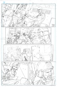
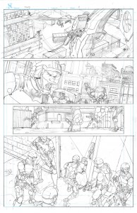
Utilize more close-ups especially after you’ve already strongly set the scene in previous panels on the same page. Pick angles that feel the most dramatic. For example in Page 2 of the March pages, the last panel’s angle shows way more of the floor and control room than necessary since we already see enough of it in the previous panels of the page. A much closer-in shot of the two characters (and perhaps from a low angle) would heighten the drama and make the reader feel like you’re forcing them to lean in closer to the action, getting them to edges of their seats so to speak. You do this with the countdown clock, but more facial close-ups would’ve helped to raise the tension as well.
I give this advice a lot, but imagine you were a sports photographer for a newspaper: what’s the most exciting angle and moment you could capture? What’s the one shot that would land your work on the front page? Don’t just think what’s the most exciting second, but the most exciting millisecond of any particular action. By capturing the most important millisecond, you allow the reader to fill-in for themselves what happened in the seconds before and after and more strongly engage them. And this approach doesn’t have to be in a battle sequence either. Depict the most important milliseconds in any conversation, the point at which the characters faces are most expressive, their bodies are showing the most tension, etc. Think of what Steve Dillon and Darrick Robertson do to make simple conversation feel like it’s a battle to the death.
I wanted to especially touch on some of the latest pages in the May 30 entry as I think they’re your best and mark a definite milestone in your development. I’m seeing more play with the angles and camera distances, giving the pacing a greater sense of drama and engaging the reader more effectively than your previous samples. But you need to take this further. Particularly on the Page 4-7 action sequence, you do a great job showing a variety of camera distances that play around with the pace and tone of the scene. But the scene still feels like it’s shot with a steady-cam, with too many shots composed almost too perfectly. For a sequence like this, things ought to be a bit more askew where you can manage the angles. Don’t compromise storytelling clarity, but play around a bit more with the camera, moving it up and down in relation to the subjects so the readers don’t feel like they are seeing this from the calm in the storm. Make them feel wrapped up in the storm. Think of how journalists shoot scenes of war with their handhelds. No shot is ever totally clean or perfectly on target. And that sloppiness is what gives the scene a more visceral, in-the-moment feel. For you, I do think an ideal model to follow are guys like Mike McKone and Barry Kitson — and especially Ed McGuinness who’s clean, straight-forward line art is married to a highly kinetic storytelling style that grabs readers by the throat. It’s deceptively simple yet incredibly hard to pull off.
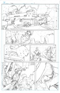
As I mentioned above, I think your work would benefit from loosening up your inking style a bit. Seeing the pencils and inks side by side here, I think I’m seeing some of the energy and looseness of the pencils subdued by the heaviness of the inks. Play around with lineweights more, emphasizing the foreground elements and characters with much heavier weights than the backgrounds. Maybe experiment too with some more looser inking styles or brush inking. I do have to say that if you think it’d take you 6-7 weeks to pencil and ink, that most publishers at a high level would probably encourage you to just pencil and hand off the pages to an inker to meet the deadlines anyway.
DG: You are absolutely right on that. Inking really isn’t my strongest suit, and I am currently taking a class with (SCAD instructor) John Lowe to try and get better at it. I think that once I am able to trust myself doing more finishes in ink and not labor over the pencils as much as I do some of that energy will transfer over. Part of it seems to stem from the amount of time I spend penciling so when I get to the inks I am kind of tired of the page and am thinking more about penciling the next one. But to be honest, I would be more than happy to focus on my pencils and then hand them off to an inker who can add to my drawing and make it look even better, or even sharpen them up even more and see if I can go directly to color from the pencils.
BA: You mentioned above getting the note to stretch out the limbs to add more impact. Basically this is a fisheye lens effect that can work. But I personally prefer to create that energy through moving the camera angle and distance without imposing an artificial feeling lens effect. I do see the benefits of this, but it’s tricky to pull off without sacrificing the realism of the scene. Artists like Eric Canete are masters of this, and there’s a lot to learn from artists like him as it’s tricky to pull off regularly.
DG: Oh yeah, I love Canete’s stuff. The energy he is able to capture in his figures is impressive to say the least. It’s one of those fine lines I’m trying to walk between the realistic and fantastic to get as dynamic as I can without pushing too far into cartoon squash and stretch.
BA: Thanks, Dan! I look forward to keeping track of your work!
***
Thanks for reading! As usual, feel free to hit me up with questions and comments on my twitter @karma_thief as well as in the comments below. To make up for the long hiatus between the last column and this one I’ll be posting the next one next week. Hope to see you again for another #Tweetfolio Review!


The inked pages on that May 30 entry have a bit of a Clayton Henry look to them. That’s a very good look to have. I’ll have to make a mental note of Dan Glasl. Hopefully that unique name will leave an imprint.