As the saying goes, you can judge the books by the covers, but you can't judge your nose.
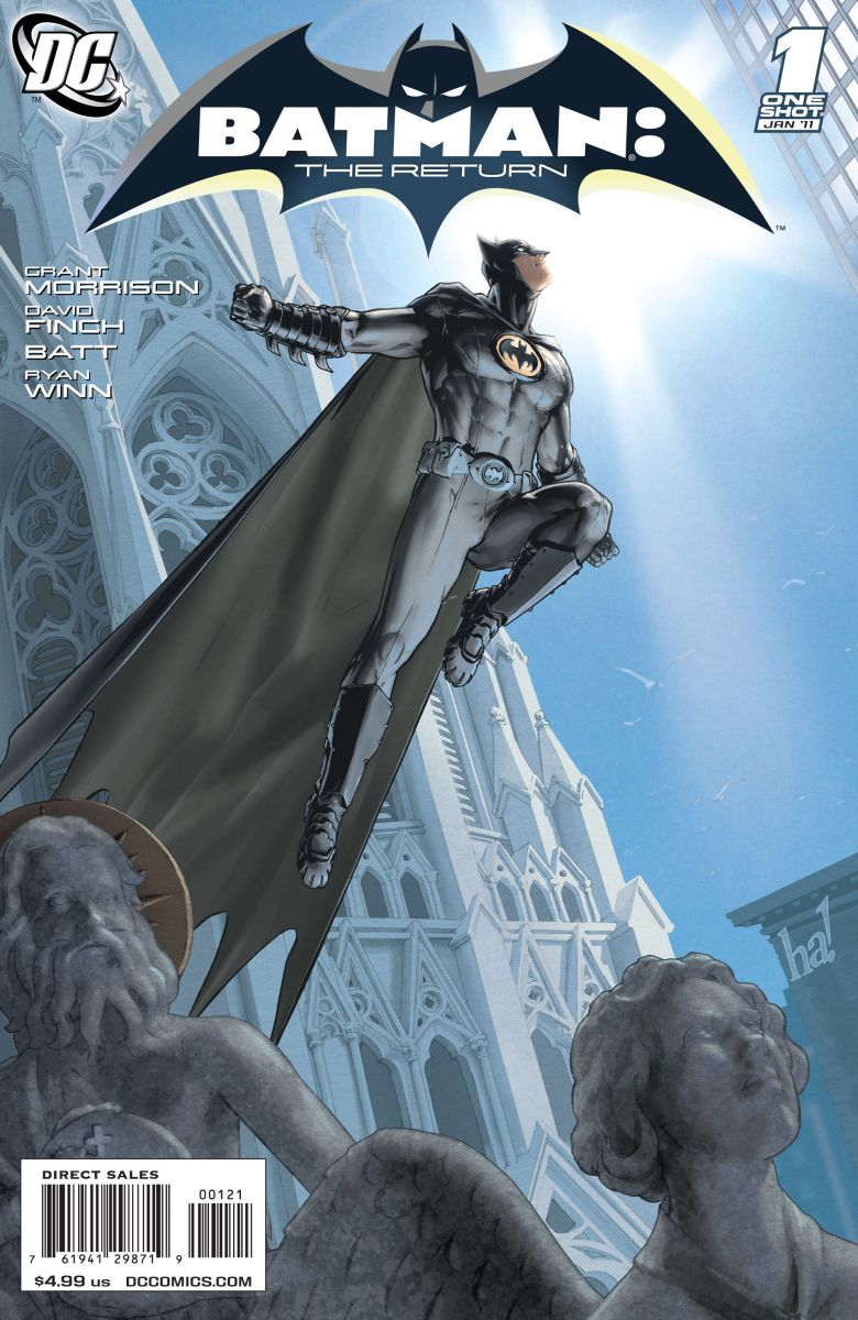
Batman: The Return
Cover by Gene Ha
Batman: Avenging Angel. A simple pinup perhaps, but I love Ha's take on an angular, structured Batman. And the statues seem to rejoice in his return. An old friend back amongst the parapets and gargoyles.
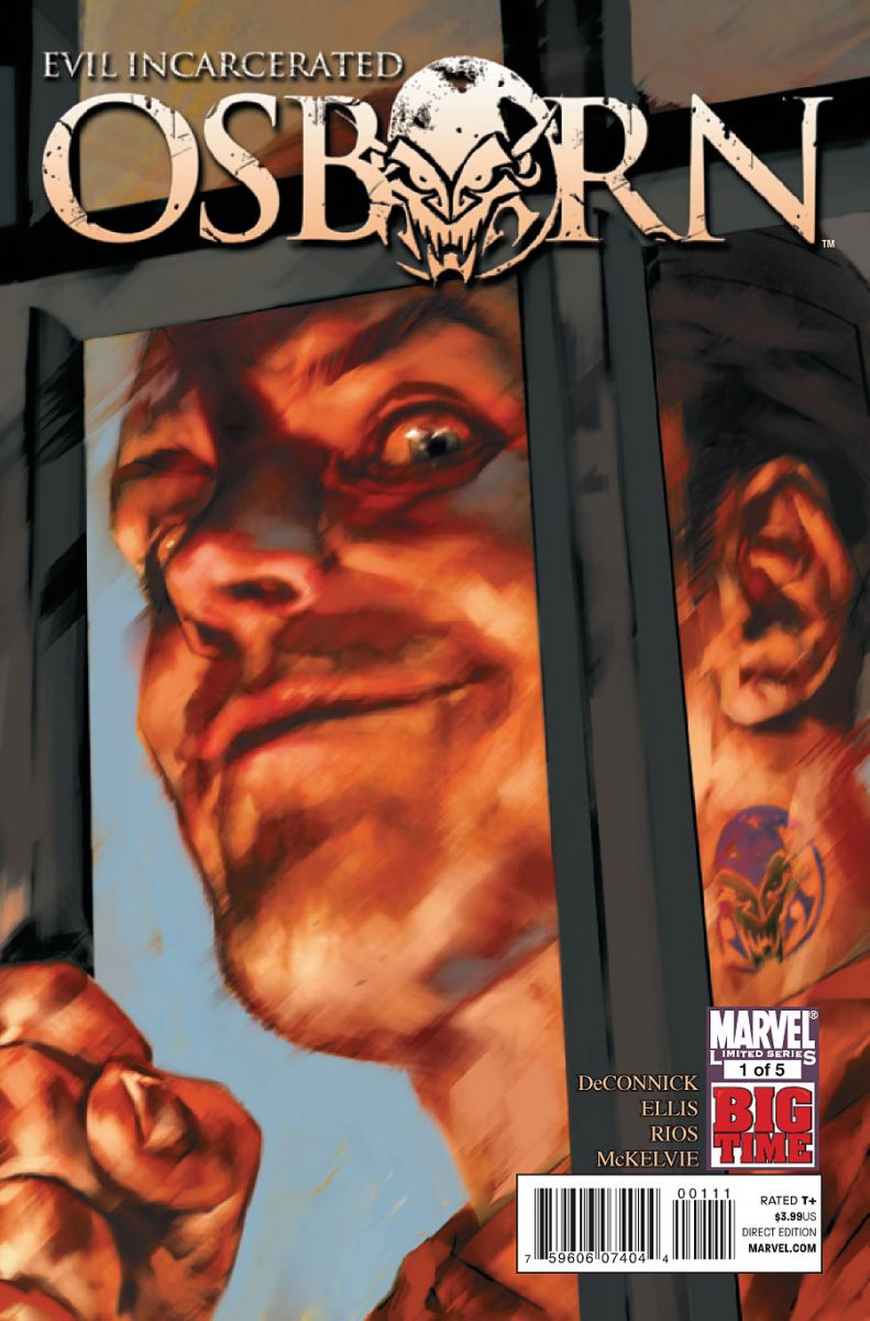
Osborn #1
Cover by Ben Oliver
You can totally read the Goblin on that face, and I'm not just talking about the tattoo. And that moist eye is of the variety that follows you from every angle.
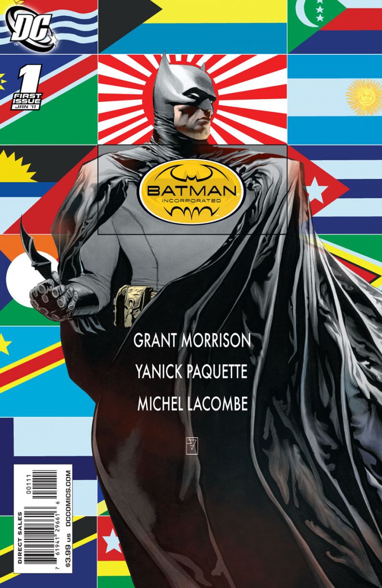
Batman Inc.
Cover by JH Williams III
Fact: Batman once found Carmen Sandiego before the game even loaded.
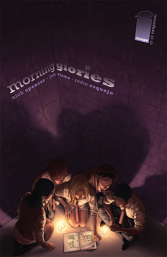
Morning Glories #4
Cover by Rodin Esquejo
Where so many cover artists simply back their characters against a wall like actors in a high school video project, Esquejo has turned this cover into a shadowy corner. Once again, the control over light and dark is pretty astounding.


batman looks weird w/o his underwear…
that morning glories cover gives me the feeling I’m sinking into a deep cave about to discover a hidden secret.Damn, it’s getting mighty hard to trade-wait on this!
That Ha cover is waaayyy better than the one Finch provided. I do like how its more bright and rejoiceful as opposed to Finch’s darker take.
The Morning Glories cover says "Goonies" to me. Very cool.
I love that flag based cover. Striking.
I think the Goblin cover might be more unsettling without the tattoo. It distracts from the eyes.
(Any post that works in a Carmen Sandiego reference is a winner in my book. Well done.)
Gene Ha is the first artist that doesn’t make that new costume look like a full-body adult diaper.
Wish my store had that Gene Ha cover. Looks beautifull. On the other note, I’m glad I got that JH Williams cover. The realism of the cape and cowl, with all the wrinkles and folds, and all those bright flags are just gorgeous. Also, clever use of the logo.
I love the art on Batman: The Return, and of course it pulls on all the emotions we batman lovers have been feeling for the past couple years. Although, I’m really curious about what went into the decision on the logo. It’s very TAS, why this book? On the other side of the coin makes me gleeful, it’s designed very well, particularly the logo. It’s really effective for the theme of the title of the book. I’m glad that non-designy people find it attractive as well, that makes me happy.
It’s such a minor thing, but I really like the text layout on that Morning Glories cover. I wonder how many would think to do it like that.
Weird. I left out a line. the Batman Inc cover makes me gleeful, not Batman: The Return.
Best one was Batman INC #1. J.H. Williams III, nuff said 😀
@convoy 83
yeah, i’ve been thinking that too, it just looks wrong and kind of disturbing without his underwear on the outside of his costume…somehow he looks kinda naked!
I love the Morning Glories covers. Great art and design and I like how they always move the title around to work with the art.
Morning Glories #4 definitely was my favorite cover this week. When I am not looking at it, I want to look at it. All day. All night.
I personally though that the Young Avengers cover was fantastic!
I was a big fan of the Chew cover (the one that you get when you take off the poster).
That Gene Ha cover is fantastic, and the one I wanted to get, but it was selling for $15 at my store…WHAAAAAAA???????
No love for The Flash #6 cover?
Personally, I think the Batman Inc. cover is hideous. But you know what? It did its job. That cover jumped off the shelf, caught my eye, and said pick up this book! Any other background, and it would have been just another book with Batman on it. The clash of colours really grabbed my attention and pulled my focus away from the books around it at the shop. Without that cover, I probably would not have bought the book.
How did Hellblazer get left off this list?
the Morning Glories cover is very nice
OhSHIT that eye does follow.
wow, that Morning Glories cover is really beautiful :O
Morning Glories covers are always well done and fab to look at.
Lots of love for the Batman inc cover. Both use the text in clever and interesting ways too.