So take a letter Maria..address it to my wife
Say I won’t be coming home..gotta start a new life
Oh Take a letter Maria..address it to my wife
Send a cover to my lawyer..gotta start a new life
–R.B. Greaves, sort of.
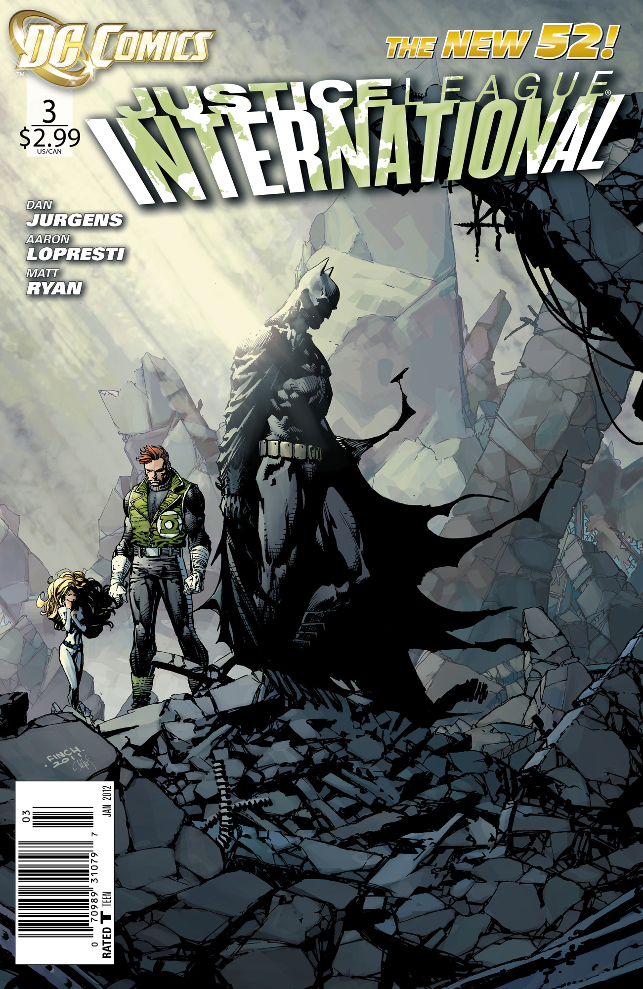
On its own, this is moody and terrific image. That said, the logo does not do it any favors, and the tone doesn’t really match that of the series itself. Does the elevated drama in this composition enhance the lighthearted book and augment the stakes, or does is it too stark a contrast that it registers as misrepresentation?
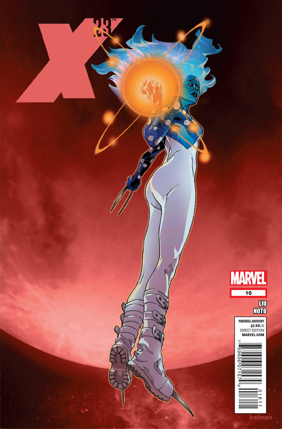
I’ve always liked the X-23 logo in its relative simplicity and smallness. It does its best here to stay out of this pinup’s way, and that’s a good thing because that pinup is one slice of vertical interest that might not work with a traditional horizontal logo. The stance makes my spine creak a little, but otherwise it’s an alluring image, and the idea of feet dangling in the vacuum of space had always held a kind of gravitas, visually. Unless we’re in a blood vessel or something, given the color. I’m not reading the title, so that could very well be the case. Then we’ve got a real Fantastic Voyage on our hands, and that’s even more interesting. Either way, there’s dread and confidence all bottled up here, and it’s striking.
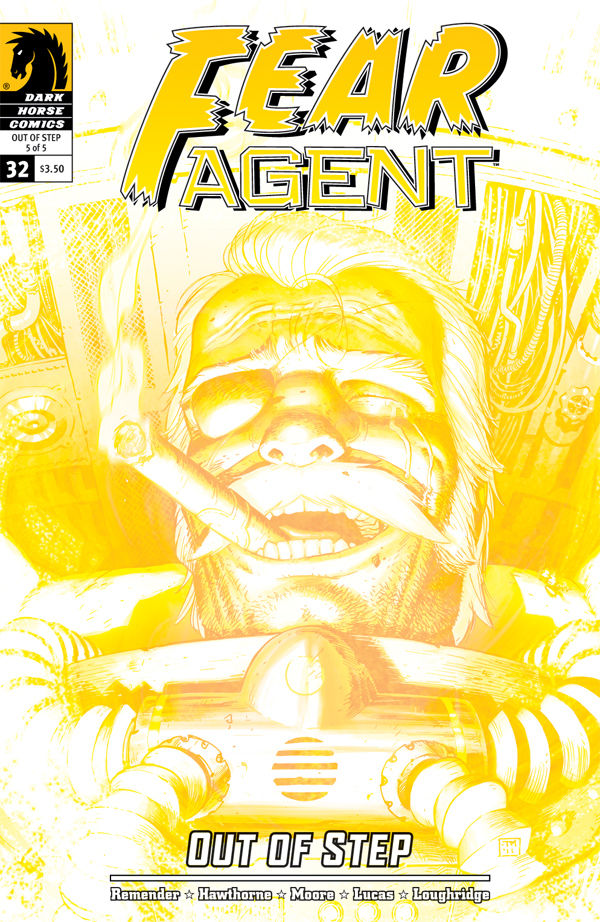
Laughter in the face of total annihilation. It’s one hell of a way to go out, but so appropriate for this series and this incredible character. The complex expression on Heath’s face is one thing–a blend of nihilistic glee and relief and acceptance–but what really makes this is the glow of impossible energies and of cataclysm. You don’t see yellow monotone a lot, but the instant reaction is that shit’s gonna hit the fan in half a second, and the fireworks are gonna be spectacular.
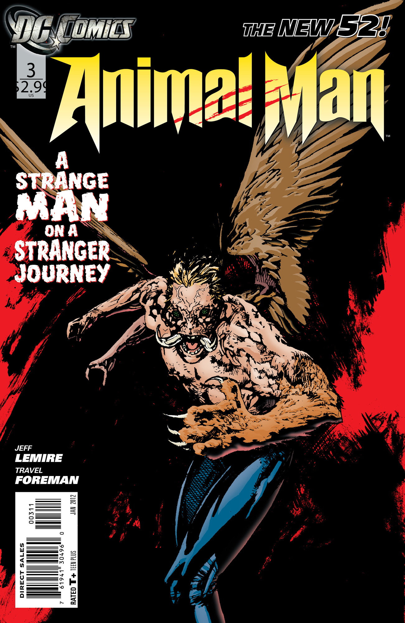
Heroism isn’t always pretty. What strikes me most about this image is that this monster is our protagonist, and not in lower tier book. At least among our own community, this is a consistently popular title with numbers to rival characters like Green Lantern, Batman and Superman. And he can look as horrific as this. It really is a strange journey, and I’m glad we’re all on it together. Foreman’s art remains among my favorite in the new 52, and part of that has to do with how challenging it is. It’s visceral and even repellent at times, but so then is life and animal anatomy. Here’s Buddy at is most ferocious and feral. That ought to be scary and is.


Thanks for putting this list together. It (as well as sketches and panels of the week) is my favorite part of Friday.
Bean
I realized a few weeks ago that it’s the same for me. I always check this stuff out on my lunch on Friday and it’s a nice reminder that the weekend is coming up real soon.
While I agree that JLI cover doesn’t really match the tone of the series itself, it’s such a striking image I don’t really care. The Animal Man cover DOES match the tone of the series and it’s a scary looking piece! Love it! Can’t wait to get my comics! Damn car problems……
That X-23 cover is, um, striking.
I really like that JLI cover. The cover made me want to read the issue, the issue made me wish I’d stopped at the cover. I’d love to read a JLI book with a little bit of the intensity that cover conveys.
I see that JLI cover and I think of the scene in Dark Knight where Bruce is at the warehouse where Rachel died.
Spot on.
Me too. I’m pretty sure they lifted it right from the image. Still, it’s effective.
awesome covers. that animal man cover is insane. thanks
i haven’t read fear agent (yet) and no practically nothing about it, but i got the “laughter in the face of total annihilation” message from looking at the cover. **that**, sir, is em-effing storytelling right there.
anyone else notice the monochromatic theme in this week’s best covers?
“no” practically nothing about it? christ. i need to read my posts before i hit submit.
I love the illustration on the JLI cover, but the other elements….geez thats just a master class in things you shouldn’t do when trying to design something. Disregarding basic and proven design concepts, …. Its just really sad that within the mainstream comics world, the state of graphic design is mediocre at best, and totally detracts from the awesome illustration work thats being done on a consistent basis.
yep. i think the x-23 and fear agent designs hang together pretty well, though.
my wife’s a designer, so we talk about this stuff a lot at home….
I don’t read Fear Agent of the man on the cover looks a lot like General Timothy Treister from the Venture Brothers.
*of should be “but”.
Count me in the misrepresentation camp for the JLI cover. For me, Batman brooding in rubble is irresistable, so I picked it up. I should’ve just admired it and moved on. It’s not that the issue was terrible, but the cover is misleading. Still, it reeled me and it’s a great image in so it definitely deserves to be on the list.
Good list as usual, PMont.
After seeing the cover to Animal Man here, I might jump on this line.