Best Covers isn’t a pit. Best Covers is a ladder. Many who try to climb it fail, never get to try again. The fall breaks them. Some are given a chance to climb. They cling to the realm, or the gods, or love. Only Best Covers is real.
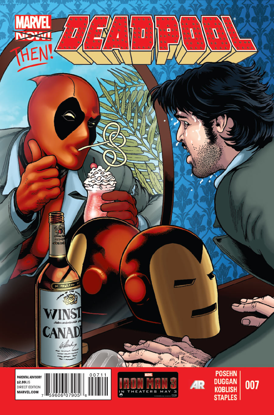
Deadpool #7
Cover by Kevin Maguire
Wade is a terrible sponsor. Possibly the worst. Jack Daniels himself would be better. The Captain. An actual grey goose.
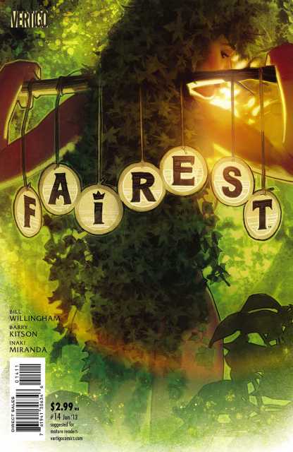
Fairest #14
Cover by Adam Hughes
This one’s actually stimulating my seasonal allergy symptoms. Such is the recreation of a dewey woodland at dawn.
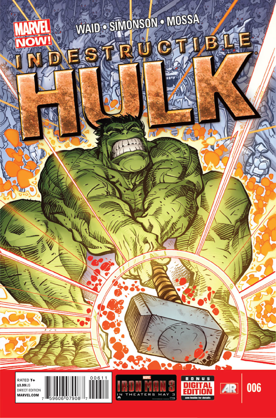
Indestructible Hulk #6
Cover by Walt Simonson
Walt Simonson is always worthy. I love Hulk’s depiction as an absolute green-eyed monster here. Just an avatar of want and bestial fury. He’s like a gargoyle. But it’s the special effects that make it. The fireworks. That sizzling krackle.
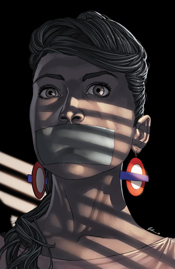
Mind the Gap #9
Cover by Rodin Esquejo
Contemporary noir. This is fear made manifest through expression and heightened lighting. Love those earrings too. They function like police flashers. Silent klaxons.
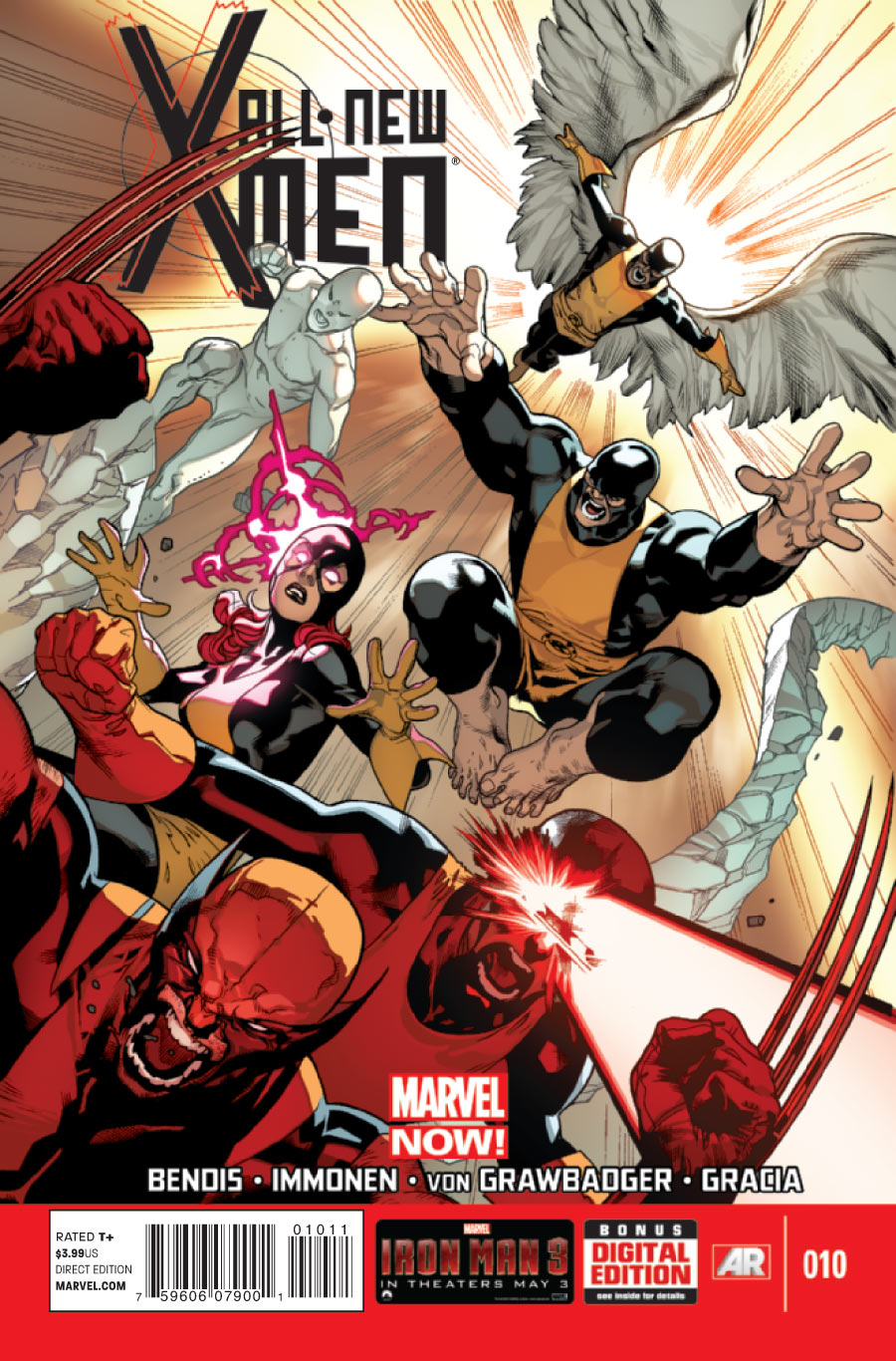
All-New X-Men #10
Cover by Stuart Immonen
A death drop. Death from above. We’re practically overwhelmed by the velocity on this one.
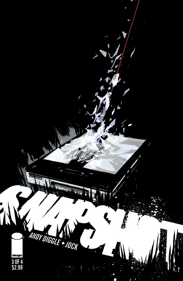
Snapshot #3
Cover by Jock
Jock’s chosen some simple, elegant touchstones for each of these covers. From the simple act of escape to this image of the pivotal camera phone being destroyed by sniper fire. What sells it though is the perfect placement of the title logo. Fantastic composition.


I really like how there is a picture of a person on the screen in the Snapshot cover. Clever. And isn’t that Deadpool cover a spoof of an old Iron Man cover, the one where he stops drinking? If it is, if makes it even funnier, in that Deadpool sort of way.
Sho nuff
http://upload.wikimedia.org/wikipedia/en/a/a8/Iron_Man_128.jpg
I’m intrigued by Mind The Gap. Is it a comic about the London Underground? Those are London Underground logo earrings.
Nah, nothing to do with the London Underground. It is set in London though I think
The first volume was set in New York, the coma girl is attacked in the New York subway in issue 1.
Not sure whats happened since then though, so maybe?
This is why I thought there was a connection to the London Underground. Check out the logos on the side of the train.
https://www.youtube.com/watch?v=7ojomTUt0X4
Ha I had not seen the Deadpool cover yet, that is fantastic!
I assume it’s relevant to the story, but it’s a little annoying that they feel the need to shoehorn Wolverine into that X-Men cover.
What are those things behind Hulk? Frost Giants?
Yep!
Love Walt Simonson but dammit that cover is bothering me. Am I the only one who just doesn’t believe the weight of Mjolnir in Hulk’s hands? Despite all the “fireworks” and “sizzling krackle” I just can’t not see it. Don’t know if it’s the angle of the hammer coming out of the grip, Hulk’s wrists or his head not being craned back far enough. The Snapshot and Mind The Gap covers are stellar though and make me wanna read those books. Always the sign of a good cover.
It might be the angle of the hammer. Hulk’s strain and the lift on the hammer do seem to be from two different points in time. It’s a fair point.
Love the Fairest cover. It took me a second to even realize what I was looking at beyond the title. Really cool composition.
Hulk just can’t get it up.