Starting in February, Marvel is releasing the first of their Season One graphic novels, re-imagining the beginning on their heroes’ careers. It’s an update, and a dusting off of stories that were told many decades ago, and is in no way influenced by DC’s similar Superman book. Stop bringing it up. God!
Regardless, I think it’s a good step. Why not give folks a chance to see the beginning, but with less bow ties and word balloons, by modern writers and artists.
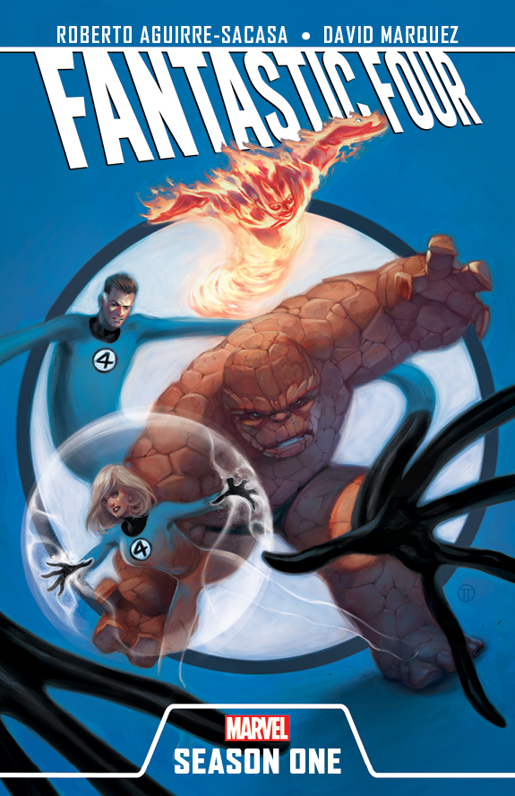
Fantastic Four: Season One by Roberto Aguirre-Sacasa (Stephen King’s The Stand, Television’s Glee) and David Marquez (Secret Warriors), on-sale in February 2012
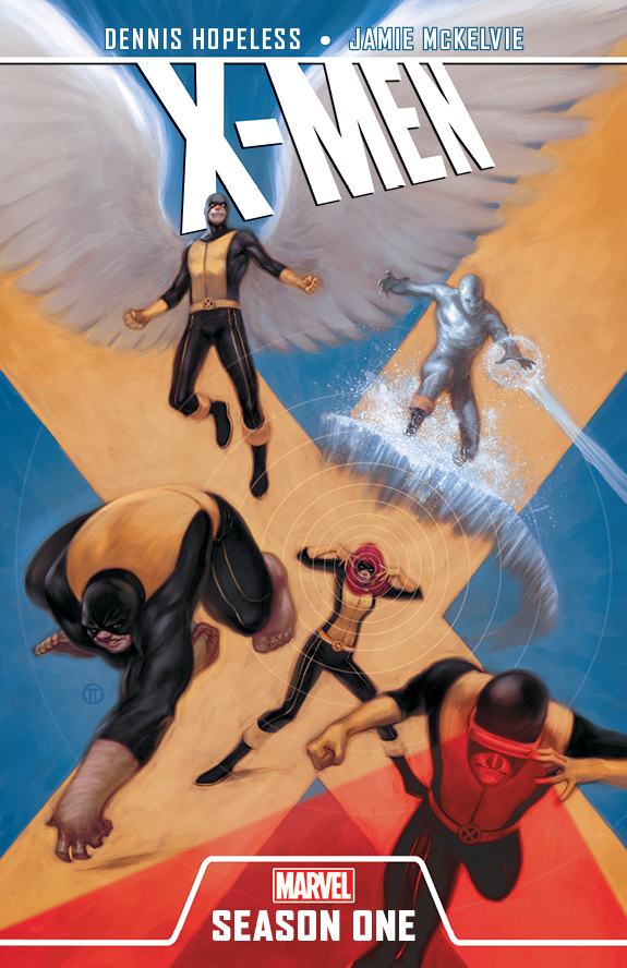
X-Men: Season One by Dennis Hopeless (Legion Of Monsters, Lovestruck) and Jamie McKelvie (Generation Hope, Phonogram), on-sale in March 2012
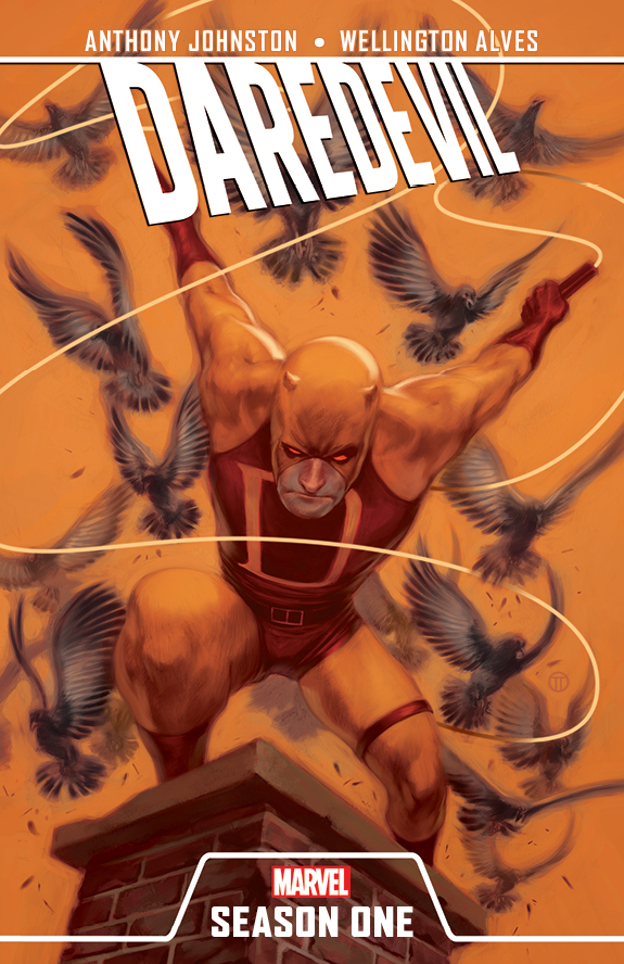
Daredevil: Season One by Antony Johnston (Daredevil) and Wellinton Alves (Nova), on-sale in April 2012
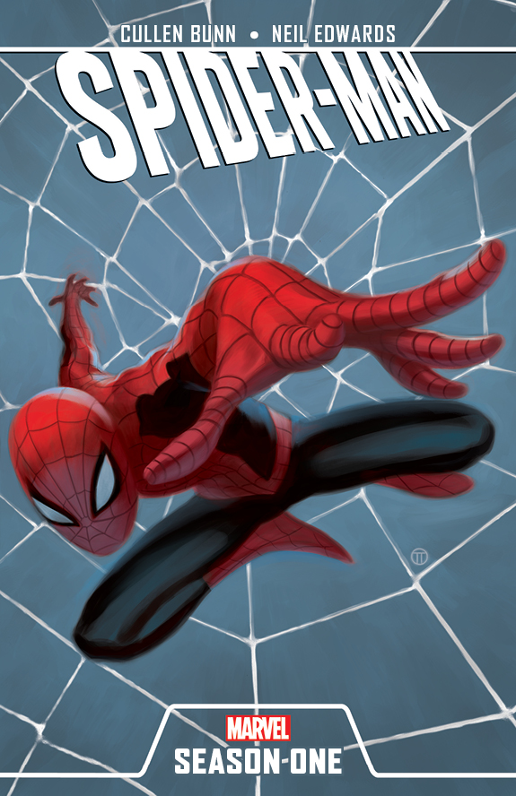
Spider-Man: Season One by Cullen Bunn (Fear Itself: The Fearless, Sixth Gun) and Neil Edwards (Fantastic Four), on-sale in May 2012
There could be some good comics in there. One a month.


excited for this!
Yeah I’ll probably give these a try, my wife will probably want to read these as well.
On board of Spider-Man and X-Men. Like the clean approach to the trade dress.
These are the two I’m drawn to. Spider-man for Bunn, X-men for Mckelvie. I was hoping Bunn’s Marvel work would lead him to my favourite character, Spider-man, maybe if this does well we’ll get more.
X-Men can’t get here soon enough. All them look good though.
I’m down for at least the X-Men one. The Spider-Man one seems a bit redundant though.
My wife thinks I’m nuts but I friggin’ love Daredevil’s yellow costume.
I ALWAYS use the yellow costume when I have daredevil on my team in Marvel Ultimate Alliance. I think it’s pretty cool and I have no idea why.
Well, i hope they go back and spell Antony Johnstons name properly 😛
That is fantastic.
LOL, your absolutely right! I’m sure the iFanboys can get that changed. You guys got some pull at Marvel right?
I like that Marvel created a logo system for these titles….creates a nice brand. Makes it feel part of the same. Its funny that they ripped off the Justice League/Chip Kidd concept. I like the paintings on the covers. Pretty cool.
Hmm. Looks a lot like the JL title font.
I haven’t been keeping up with this, are these in continuity?
No they are not in continuity. They are a new series of books.
Isn’t this essentially what the Ultimate line did? Re-tell these stories outside of standard continuity, making them more modern with less cheesiness?
These look like fun. Some extremely necessary fun. I recently re-read a ton of early X-Men stories (thanks to that mega-DVD they released a while back) and they are just about the opposite of timeless. The concepts are still great, but I really struggled with the overwritten dialogue, glaring editorial errors, and crude art. I know about the contextual issues of comics in the 1960s, so I’m not saying they’re objectively awful, just that a modern update featuring all the craft available these days is appreciated.
I’m not sure how the new art will be any better than Jack Kirby…
Yeah crappy crude art definigin modern comics language for all eterning rassle frassle character design grumble mumble….
I know it’s blasphemous, but my brain just doesn’t connect with the Kirby art I’ve seen. Granted, his X-Men run is the only full-length Kirby work I think I’ve read, so I know I’m in no position to judge the totality of his work. I’ve heard the man could draw a book in less time than it takes me to blow my nose, I have a great appreciation for the things that came from his imagination, and I understand that the inkers he worked with destroyed a lot of the nuance of his pencils.
Have you guys done a show about Kirby? (I glanced at the titles in the archive and nothing jumped out) I know it’s something worth learning to appreciate, but I’d need some guidance.
But I don’t just mean Kirby when I refer to the early X-Men art as “crude”. As I read through the series (I’m up to Giant Size in 1975) I found it difficult to get into any of the pre-Neal Adams art without the added caveat of “considering the scheduling and printing limitations of the time).
I mean give Jack Kirby a tongue bath all day long if you want, but he can’t even carry Greg Land’s gym bag, right? (*runs away protecting his head and neck region in case the sarcasm isn’t obvious*)
Ok you’ve never read Fantastic Four which is just mindblowing at the speed his art develops issue to issue and the breadth of creativity him and Stan were putting out month to month. If This Be Doomsday and This Man This Monster alone are worth the price of admission,
X-Men isn’t his best Marvel work, but you can’t deny the genius of his designs which have barely changed and seldom been improved upon even 50 years later.
I actually really dislike the early Lee/Kirby X-men. Almost every issue seems t be “Villain shows up, X-men get their asses kicked, Professor X shows up and mindwipes everyone.” It just wasn’t very good.
That being said, I absolutely LOVE the Lee/Kirby Fantastic Four. That book is insane, in the best possible way. And I am a huge fan of Kirby’s art. And yeah, Stan lee’s writing may be VERY dated, but anyone who can have not one, but two members of the team yell “SUFFERIN’ CATS!’ in the same issue is OK by me.
I started reading X-Men from the beginning a while back. I stalled out in the 30s somewhere. The Lee/Kirby stuff isn’t great. The stuff immediately after it is pretty bad. I need to get back on the horse. I know it will all get better when I get to Claremont…
Looking forward to these, I’ll prob end up getting all 4 but for sure getting the Spider-man and Fantastic Four as soon as they come out.
Does anyone know if these are hardcovers or paperbacks?
They will be released as hardcovers then in TPB.
I’m more interested in knowing if they plan to release these digitally!
These look pretty cool. On board for Spider-man and Daredevil.
I do like the sound of some nice OGNs coming out of the Big Two. But why the need to look backwards? Marvel should be using the OGN format to push their brands FORWARD.
Less bow ties?!? Then what’s the point!
Less bowties, you say? Not after me and my marker pen are done…
Unless I hear absolutely terrible things about it I’ll be grabbing the DD one and if the others get rave reviews I’m in and will be passing them on. Looks like a fun Marvel gateway.
Whenever I see that yellow Daredevil costume, I think “How could they not know he was blind?!”
I have never heard of the term “cover dress” before. I was pretty sure it was going to involve Anne Hathaway and I am relieved that it does not.
I hope this signals a departure from the way Marvel has been branding their recent events. I really hate the Fear Itself (and the Heroic Age, etc) college level “graphic design-y” look that never complemented the art. It always looked like somebody high in the editorial ladder bought a new mac and decided to “make all the covers look better”. I’m glad we only had to deal with about a month of those Green Lantern banners distracting from the DC covers. These look great!
As for the books themselves, I’m really excited to read Bunn’s Spidey. Especially after hearing him talk about it on the video podcast. That one’s a buy for sure. The rest look cool too!
I think these can be a lot of fun, potentially. I would most likely pick up the Daredevil one, and probably the FF as well.
wow, they all look good. spiderman looks really nice.
I like the designs for the covers, very simple yet telling. I’m interested in reading most of them.
Why do the X-Men get redesigned costumes while everyone else wears their traditional togs?
awesome can’t wait for the x-men one