 Late Friday it was leaked that DC Comics had registered for a trademark on a new logo. Before anyone gets too excited (or agitated), this is a small step in a much larger process and strategy. There is still a lot we don’t know and it will be a while before we see anything in production. But as someone who loves comics and works in marketing and branding, this is the kind of thing I love digging into.
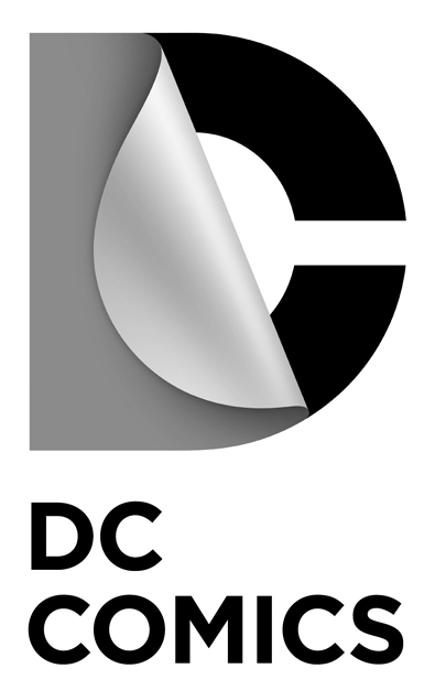
According to the U.S. Patent and Trademark Office’s (USPTO) public database, trademarks have been registered for both DC Comics and DC Entertainment. “Color is not claimed as a feature of the mark. The mark consists of the letter “D” flipping back to reveal the letter “C” and DC COMICS.” (or DC ENTERTAINMENT in the case of DC Entertainment).
Now it is possible that DC is just legally covering their bases and are still planning on doing some tweaking. But applications were filed for 19 different “Good and Services” categories for both DC Comics and DC Entertainment. To me that feels pretty aggressive. They’re laying claim to this logo not only on their comics, but all of their merchandising. And they’re doing so for DC Entertainment as well. Once the trademarks are in place, I think is the logo we’ll start seeing.
Speaking as a marketer, logos are a pretty big deal. They’re the public face of an organization and should be part of a larger brand strategy. A good logo is (or becomes) easily recognizable and visually conveys what a company is trying to “say” to its consumers. With this proposed DC logo, the “peel” is the most obvious element. To me, it looks more like turning a page than peeling anything. I think the image is trying to spotlight DC’s quality stories and their long legacy as storytellers. It feels like something a publishing company would use. From more of a design stand-point, I expect we’ll most often see this logo in the classic DC blue, like previous logos, but with the trademark they’ve left themselves the flexibility to use other colors as well, like they do on the current comic covers. My only real criticism is the amount of shading and gradient in the proposed design; I don’t think the logo will render well in two-color printing. There is always a subjective element to logos, but what’s important to remember is that this logo was most likely designed by an agency that specializes in design and brand management to convey a specific message. I think this does that.
 Courtesy Underworld Magazines
Logos are also not something that should be changed often. The current DC “swish” logo has only been in the market for 6 years, and had to compete with the much more recognized “bullet” that had been used for thirty years. The swish has barely had time to grow any legs, so I think it’s interesting that DC is looking to replace their logo so soon.
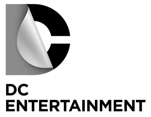 On the other hand, DC Entertainment was “launched” in September 2009 and has yet to have any kind of brand identity. Aside from what was outlined in the main press release, I’m not sure what exactly DC Entertainment does. Up until now, it feels as if DC and Time Warner are just branding one of their internal departments. A logo, particularly as part of a larger branding strategy, will hopefully change that soon.
Still, I can’t help but feel like the timing on this is off. I know it takes a while to develop and implement a new branding strategy. But it’s been over two years since DC’s restructuring, and with the New 52 launch, the comics publisher has been working hard to expand its market. I can’t help but feel that they missed a valuable opportunity to present a new logo and new brand identity with the start of what was touted as a “new and refreshed line of comics”.
I’m sure it’ll be several months before we see anything start to happen with logos at DC. And I’m sure we’ll see some other changes in their marketing and advertising at that time too. But it appears DC is definitely doing so freshening up in terms of its image.


Boy is that boring ass logo an Identity Crisis waiting to happen…
Bleeding Cool are currently speculating something could happen as early as tomorrow.
Personally, I think it works in the current new media age. and it fits nicely on a book spine and in the top left hand corner of a comic book.
I also care more about the 20-30 pages of story than the logo.
Nothing will be happening that quickly. The trademark application was filed on January 5 (according to the USPTO database) and it take three months for a judged to be assigned to the “case”. They won’t use this logo, or any logo, without a registered trademark.
as i understand it, a brand mark needs to be shown as “used in commerce” (as well as a ton of other things) in order to get trademarked. You can’t just submit a concept that is not implemented anywhere. It has to be in use. The trademarking process is very very arduous….many established brands have had trouble getting that TM.
So much for it not happening so quickly eh? I never thought they would pull the trigger on this. I didnt like it at first, but after seeing some of the different treatments of the logo type, it’s growing on me.
I’m sure it looks great on iPad screens.
I really don’t like this new direction. It seems to achieve a major rebranding cardinal sin. They haven’t retained anything from previous iterations so brand confusion will be a major concern. Its too big of a jump.
I really like the current 2005 era logo. It recognizes the past while being contemporary, and its simple to understand.
This current one can be tough to read.
I really don’t like that it depends almost 100% on FX (drop shadow and gradients) to have any impact which is always troubling, especially at smaller sizes. The type placement below feels undesigned and “placed” instead of integrated. There is so much awkward negative space…its not a coherent unit. I know its meant to be utilitarian and swapped out for different divisions but i’m not a fan of that choice. I’m really interested to find out the firm that developed this.
There was another post i saw somewhere else online where they did a side by side with a Discovery Channel sub-brand (UK) that this logo is completely ripping off. (its a D with the counter peeling over) That also is very troubling.
http://www.bleedingcool.com/2012/01/15/swipe-file-dc-comics-discovery-channel/
Have we considered that it might not be for use on comics? It’s clearly a more sleek corporate looking mark, perhaps it will only be used for those sort of purposes.
It’s like Tropicana all over again.
This new logo doesn’t speak comics to me, which may be DC’s intent. If that’s the case, then they succeeded with this boring-ass logo.
The marvel logo just says MARVEL.
As a stand-alone logo I really like it. Kerning ‘comics’ to the same width as the DC peel is a nice touch, as are the fixed hight caps. The DC Entertainment one needs some work; ‘entertainment’ is way long.
However on covers it’s going to look at odds with the current run of awful book title logos.
I don’t love this logo but you are right the way the baseline and cap height for both letters line up is pretty cool, and the “entertainment” is upsettingly long.
Eww. I understand that DC is trying to re-establish themselves and an easy way to do that is with a new logo. But the stars, present in every logo until this redesign, were an important visual link to the company’s past and I think the page turn element is just cluttery and confusing. Sorry DC, try again.
There are no stars in the first logo.
@Conor Good catch. I saw the dots and mentally extrapolated.
Superman is the star in the first logo. =)
the graphic above is incomplete, there have been several logos without stars. m
http://www.wired.com/geekdad/wp-content/uploads/2012/01/DClogos.jpg
I gotta say, I think the swish logo was an improvement, and to abandon it this soon for something so staid and boring is a bad move. The “page turn” or “peel back” element doesn’t read as “comics” to me at all. And when it was pointed out to represent that, I find that it’s a little on the nose. I really hope this doesn’t end up on the covers of the comics, and is meant to be used for corporate purposes.
It looks modern, for 2012, and all that jazz….But man it’s boring to look at. How did they go from a simple circle design to this? I feel like I need them to help fix my PC rather then read comic books.
It makes no difference to me.
Does this remind anyone else of the Warner Bros. logo? In the 70s and 80s, Warner Bros. in attempt to seem more modern, kept messing with their logo. In the 90s they came to their senses and went back to the classic WB-shield. Bring back the 1976 DC-bullet! It was timeless.
yeah those old WB logos were a hoot. I think part of it was the constant re-positioning and ownership games that were happening…but yeah always something different.
This new brand mark screams “Pepsi Curse”. Pepsi changes their identity every few years trying to chase whats current, and they’ve just never been able to establish something iconic. DC has an iconic brand mark already, that has a lot of room to reinterpret. Kinda sad they threw all that history in the dumpster.
It looks like a bird’s eye view of someone peeling the paper shield from a public toilet.
HAHA. yes!
Oh no. I don’t think I can see it as anything but now that you’ve point it out. Ha!
Yep, now that’s how I will always see it too.
I don’t care for it. I don’t see that as a D being peeled back – it looks more like a cover or seal (like the toilet seat shield anaolgy Maty!). I like the swish.
I’m cool with it. To those that think it doesn’t say “comics”, my counter would be that perhaps DC is looking to change what “comics” means in the future and wants a logo flexible enough to handle that?
i think they want to be an entertainment / IP company that happens to publish comics. Movies, cartoons, games, merch… That’s their future.
And I think that’s a smart strategy. As much as I love comics, you have to admit that they’ve kind of become the horse-drawn carriage of the narrative entertainment media world.
I think it’s a great idea to change their logo. They should have changed it in time for the relaunch. Would have had a much stronger impact.
This logo is a bit too bland for my tastes. I don’t see it as strong or destinctive enough to stand out and make people identify it with DC. It looks like a million other simple, bland computer company or tv channel logos. Really looks like it should be the logo for a tv channel. Reminds me a lot of Comedy Central’s new modern, minimalist logo. Seems to be the way to go for that sort of deal. Or if you’re a software company. But for a company of DC’s stature and history, I really think something with a little more umph is called for.
It’s clean, but man, it’s so different from previous designs that it’s hard to jump on this. I’m sure in time it’ll be fine.
Logo redesigns usually piss people off no matter what..
Remember when UPS update their logo from the classic Paul Rand mark to the current gradient Shield?
The design world was in a uproar.
It doesn’t help that Milton Glaser designed the original DC Bullet logo….not great to disregard a legend like that.
I’m hoping the “Tropicana Effect” happens and design community criticism embarrasses them out of this move. Hoping Steven Heller has an opinion on this…
good point
I like it but doesn’t feel “young.” Fitting for a production studio, and less for a comic book company (which I think is the point).
One thing I’m sure is an issue, is they have to be sure not to look too much like this:
http://0.tqn.com/d/skateboard/1/0/S/X/DC_Shoes_Logo.jpg
Maybe that has something to do with making it more of a single symbol image?
It reminds me of this, that was on the tail end of a lot of 80’s cartoons. http://www.youtube.com/watch?v=aDOuFnZnPMs Doesn’t really strike me as modern, personally, since that is the first thing I thought of.
It looks like a logo that a doctors office would use
It’s a good logo. One I’d be proud to put in my portfolio.
Visually outdated in 3 years.
Toaster: “It looks like a logo that a doctors office would use”
How about a plastic surgeon?
nice
i dont mind the new logo. its very corporate, simple and modern, which is why so many hate it but i have no problem with corporate, simple and modern. i agree about the difficulties in having a logo that depends on gradients etc, but a majority of its uses should have no problem with printing. i imagine it looks better animated where you see the peel.
marvel has been using a simple condensed bold sans serif white font in a red box for years, nothing special to speak of and certainly doesnt scream comics. hasnt hurt their brand apparently.
it would have been nice to have this at the relaunch, (along with a whole new approach to cover design) but then it would be extra haterade on top of new costumes, new continuity, new logos and new creative teams. i wonder if this just wasnt ready in time, or if it gives any credence to the rumor that the relaunch was supposed to happen later (new 52 for a new year?) or if its all just a way to stay at the top of the news.
i dont know about you but id pay $$ to see the endless stream of rejected logos, the evolution up to this and the notes that were a part of it. having been a part of too many identity redesigns and the endless overabundance of cooks it entails, it would be a perverse thrill to see the bullshit from the outside for a change
also, the font is called Gotham!
The swish might’ve looked like a laundry detergent logo, but at least it denoted some bit of energy and enthusiasm for the product. Are they really going to put this new thing on the big screen before “The Dark Knight Rises,” and “Man of Steel?”
A motion animation to show a comic page turn to read out DC before either of those movies? Me thinks awesome.
I first took a grander notice of the DC logo with the trade of Batman: The Joker’s Last Laugh. On the cover, the Joker is clearly supposed to be tossing the old, circular DC logo up in the air, as if it were a ball, and that’s how it probably looked on the issue cover. On the trade, the “swoosh” logo doesn’t pull it off as well.
How dull. Also, if the thing peeling back is meant to be a D, shouldn’t there be a hole in it?
it feels to “professional” if that makes any sense. to me a comic logo should exude fun.
but all that really matters is whats inside for them to keep getting my 2.99.
Under Consideration’s review:http://www.underconsideration.com/brandnew/archives/dc_may_be_its_own_villain.php
I really don’t give a shit about logos but it does look like someone peeling off the paper of a temporary tattoo of a C.
totally agree!
It definitely doesn’t have anything that says comic book to it. I saw some color changes on tumblr that made it better but it still feels more like an agency logo than a comic company logo. I understand the point about it being more of a turning page then a peeling layer but it doesn’t come across that well (in black and white gradient at least.) Keep the star somewhere (Put it on the turning D, have cut into the C somehow) do something that makes it look like it belongs next to a comic book and not a text book. Though if we are looking at it as more of a production company logo then it is fine, though I still feel they need to find a happy medium between comic book and production company so that having this on a comic isn’t so awkward. Or keep the awesome 2005 logo, that has proven to be fantastic on the comics and in the little production marker before there movies.
The gradient is something I have had a problem with since the new Batman logo, but with how many times they used it on those, can’t say I am surprised. They can keep the font though, it’s a gorgeous clean font. I
Now what if Johnny DC gets fitted with the new logo? It’d look like he’s taking his top off. And let’s not even discuss the refitting for Jonni DC!
It looks like a crappy logo from a random small time computer software computer in the 90’s.
zzzz….Wait, what. Sorry I fell asleep looking at that boring logo.
Adobe Illustrator has done a bang up job of homogenizing the graphic arts.
that 1976 logo instantly makes me happy
I have the same reaction, but I think that speaks to DC (and Marvel) having spent a lot of energy to keep our nostalgia alive.
Love it or hate it, at least this new logo is trying to suggest a major change in the way the company sees itself. Whether that’s a good thing or bad thing for longtime fans remains to be seen.
That potential new logo looks horrendous to me. I hope they don’t use it but I’m sure I’d get used to seeing it eventually.
This wont be a logo used on the front covers of the comic books. Probably more of an internal letterhead for the company than anything else.The “dc swoosh” logo is kind of perfect for all the comic book applications for the company its simple, and dynamic at the same time. This new one is a snoozer.
if they do that then DC just failed at branding…it really goes against the entire point.
It’s not that it is boring, I think it is a strong logo, especially for a publisher. This would work well for prose books.
It is a big departure, rendering the logo to feel fan-made. It just needs more color and youth.
I think it looks as misguided as many of the new book logos. Too computer generated. It also looks like it is ashamed of its product. Not a fan. Especially don’t like how it’s DC followed by DC Comics. Keep it simple. Even though one DC is a pic and one is part of the name, it still looks redundant.
I heard speculation elsewhere that it might be intended to be in motion, that the D might peel away progressively to reveal the C, and that it might be intended for a property other than the printed comics line.
The more I look at it, the more I think it would fit right in with the other icons on my iPad homescreen (I mean that as slightly more positive than negative, but mostly as an observation).
I with edward on the 1976 logo, that is still my favorite. This new logo if that is the case is boring and well seems to have no imagination and no drive. The current logo seems fine to me and well also true for this is the book itself is more important.
K
This logo will make sense for me when DC starts publishing round comics.
What’s sad is that it doesn’t even read easily as the letters “DC” – seems like this would be a priority. Instead, text is needed to clarify below the logo.
Lame.
Taking a second look, the cheap looking text underneath the logo does it no favors. If I cover that bit up the logo looks a bit better. Some color might go a long way also. Still, it strikes me as something that seems like a neat idea but doesn’t translate into a good logo. It might work for a company that sells bandages.
To give an example of good graphic design in comics these days (which the DC logo isn’t), I really love Jared K. Fletcher’s rebranding of the X-Men titles – clean and modern, unobtrusive but bold, unified across the line, and with elements of the classic logotypes.
Where would I see this logo? Some possible things: Accounting firm, legal firm, doctor’s office, those doors in malls that don’t really go anywhere, possible to mall security or management. Paper company. The logo that pops up when you watch a DVD all the way through to the end and think “Oh I guess they made the DVD.” Not the movie studio, but the people who did the DVD burning.
This also could be just a corporate letterhead logo- something just to be used on vendor or corporate correspondence. ?
The DC vs Marvel Shit is becoming retarded
I will second that! Allegiance to a subsidiary of a media conglomerate is one of my least favorite things about comics fandom.
As for the logo… by the time I probably get use to it they will just change it anyways. Not that big of a deal.
I was hoping they were bringing back the “Go Go Checks”. 🙂
Who is running the graphic department at DC?
The logos with the new 52 were very plain – many seem rushed.
This new DC logo design has many weaknesses; Especially when using such a dominating gray gradient tone based on a tacky . . . decades old Photoshop filter.
Successful icons “brand” an image into your memory – using gradients weakens an icon effectiveness and simplicity (and gradients simple doesn’t print or scale well on various mediums.)
DC’s 2005 logo is impressive, shows energy and it keeps the use of gradients to a minimum.
This latest DC logo version – just looks like someone pulling off a scabby bandage.
I definitely like it more now then what first came out… more on the logo change here: http://martelljt.wordpress.com/2012/01/19/dc-entertainment-unveils-future-brand/