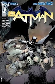
 I was listening to an interview with Batman artist Greg Capullo recently and he was talking about the fact that he tends to steer clear of photorealistic drawing as a rule. Simply put, he’s much more interested in cartooning in the truest sense of the word rather than creating images that mimic reality. I’d never really given the difference a whole lot of thought, despite years of consuming comic books and the art contained within them. Maybe I’m a bit too passive a reader, but I’m typically more story and writing oriented when it comes to judging my books. Art was always sort of a secondary thing for me, as a good story can make up a lot of art that’s either uninteresting or lacking in some other way. But as I contemplated the distinction between photorealistic comic book art and more traditional cartooning, it dawned on me that I’ve never really responded emotionally to artwork that attempts to represent reality in the photographic sense. And while the work of artists like Alex Ross (clearly the master of photorealistic superhero art) and Greg Land is certainly compelling in their ambitiousness and creativity, there’s something about that sort of hyperrealism that basically leaves me cold.
I started to wonder why I was drawn to one type of art over the other. Why would I rather read a comic drawn by the very stylized Skottie Young than Alex Ross? The writing and story junkie in me shifted to art theorist. Shouldn’t a very realistic image of say the Sub-Mariner transport me? Shouldn’t images that seem almost tangible and three-dimensional give me a deeper sense of these fantasy characters as potentially real people? Shouldn’t’ a good story plus realistic imagery be the perfect formula for good comics? And why do I get a more emotional hit from Mike Allred’s Fantastic Four work when his pencils are so intentionally lacking in that sort of photographic realism? After giving it more serious thought, I came up with at least a partial answer. Simply stated, the reason I’ve never really warmed completely to photorealistic art may have at least something to do with the theory of the “uncanny valley.”
Now if you’re not familiar with the term the “uncanny valley,” it’s a term that typically relates to aesthetics and their connection to robotics and computer animation. Basically, the idea goes something like this: Robots that look very human but not quite human enough have a tendency to be off-putting to actual human beings. The same can be said for computer representations of people in movies and videogames. If you look back at films like Beowulf or Polar Express, you realize that the “people” presented in these movies have a kind of repulsive strangeness to them. They’re fairly close to being representative of real human beings, but they fall short. And as a result, they elicit a weak and somewhat limited emotional response from the viewer. When studied, that response is represented on a graph as a dip in “emotional connection” i.e. the “uncanny valley.” To put it into less complicated terms, robots that look like humans creep us out. Ultimately, I think this theory holds true for comic book art, as well. Simply put, if artwork tries too hard to look like reality, then the emotional response from the reader (in this case me) can have its limitations.
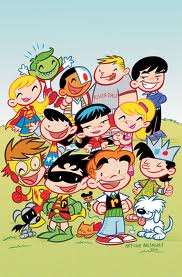 Now I’m well aware that some of very well respected books are composed of photorealistic art. Kingdom Come and Marvels are two of my very favorite, for example, but I’d also argue that the very realistic art these books contain aids in the commentary the stories are trying convey. Both books are grounded in a kind of historical comic book reality, so having realistic imagery serves an agenda and grander purpose. For less ambitious books, I’m discovering that the more an artist tries to emulate reality or draws directly from realistic images, the less likely I am to connect with the characters. Even something as simpleminded as Art Balthazar’s Tiny Titans feels emotionally stronger because of the cartoony, almost Peanuts-like depictions of the characters. Imagine those cute little Titans drawn by Alex Ross. Creepy, right? Skottie Young’s Oz books also hinge on a stylized lack of realism to give them their emotional resonance. Realism it seems might even be a hindrance to good storytelling.
When I was first exposed to photorealistic comic book art, I think I was impressed by the novelty of it. It was like something I’d never seen before. But that novelty tended to fade, as comics that lean toward the photographic tend to also have a kind of static quality to them. Sure, you can take any one image created by Alex Ross and hold it up as a kind of unique visual interpretation, but put them all together in sequence and I tend to find them chilly and distant to the point of being distracting. Maybe the “trick” at the heart of it is what I find problematic, as the art becomes more about the artist’s clever toolkit than about moving the story along through dynamic and emotionally compelling pictures. I’m not saying that it’s the goal of the artist to be invisible. But I would argue that the goal of the art should be to transport the reader to a time and place, as opposed to being a series of juxtaposed pin-ups that shout to the reader “Look what I did!”.
Ultimately, it’s a case of what you want from your comics and the art contained within them. Do you want imagery that 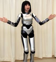 seeks to replicate the real world? Do you want art that looks as if there was a photographer snapping pictures of Spidey and Electro in battle? Or do you want images that touch you on a deeper emotional level, even if they aren’t representative of some photographic version of the characters, things and places they depict? For me, it’s all about having fun, feeling emotions and the ability of a story through its art to take me somewhere. I essentially have a pretty clear photo of Spiderman in my head already, so I tend crave art that can tell me an emotionally resonant story through drawings that look nothing like that image in my noggin. I admit that I’ve never cried while reading a comic, but I wouldn’t be averse to it. Truth is, I’m a crier, and there’s nothing I’d like more than to get choked up while reading about Batman sacrificing himself to put Darkseid out of business. But when and if that happens, I tend to doubt it will be a photorealistic book that gets the tears flowing. Until that time, I think I’ll do my best to avoid that so-called uncanny valley.
Gabe Roth is doing his best to keep it real…but not too real. @gaberoth on Twitter.


For some reason, the “uncanny valley” doesn’t affect me, so for me, the more realistic artwork appeals to me more.
Someone like Skottie Young just pulls me out of the story because I feel like it truly is a cartoon and not something that I can take seriously.
Ideally, you get guys like Perez or Byrne or Adams who are not so realistic that you get into that valley but are not so stylized either.
The key to making great comics isn’t photorealistic or ‘uncanny’ art – it is creating art that can be believed.
I agree with you, Gabe – I’ve also seen a few comic books that seem to be made by animating with a Playstation 3 engine and then snapping screenshots of renders. As experiments into representation, they work. But as far as telling a story effectively, they really fall flat. And they’re creepy. Or silly.
There are also some comics made up entirely of photos that are just very filtered in Photoshop. Sometimes this looks pretty okay, but to anyone who has touched a toe into Adobe programs, it looks pretty lazy.
So, although there might be more ‘reality’ in renders, there is more emotional connectivity, which is more real, in really good, drawn art.
A big thing for me is the presence of the artists hand. Not only techniques, but interpretations of reality. We live in a HD age, where everything looks perfect, so when viewing any kind of illustrative art, i tend to find stylized art more interesting. Things that look obviously illustrated with pen and paint (or digital effects) tend to hold my interest more than someone who tried to imitate how a camera sees. I’d rather see abstraction, abbreviation and the artist “fingerprints” on something more than a guy who can successfully draw logos on every piece of trash in an alley, or every window ledge on a skyscraper. Its not a matter of good or bad, but more what’s interesting to me. I can see anything in the world in HD clarity with google, but i can’t see things in a stylized, abstracted cartoony vision.
I often find that the coloring takes me out of a page of comic art. The more rendered it is, the less it holds my interest. I guess the digital tools and techniques take over and upstage everything else, which causes me to lose interest fast.
I think the term “photorealism” is overused in comics. There are maybe 2 or 3 guys that push that, but for me they always fall short. I’m still aware its an illustration and not a photograph and that’s my fundamental problem with pushing realism in illustration. I feel its a loosing battle from the start.
Less is more. I can tolerate alex ross but somtimes it looks a bit off im prefer him as just a cover artist. Any other artist attempting the style is unbearable, especially when its cg/heavly photosopped. It just looks like wax.
i feel the same way. his covers can be tremendous, but i’m not as big a fan of his interior work. Everything looks frozen in time.
I like photorealistic art, in which I group Alex Ross, Steve mcNiven, and maybe Greg Land (probably) as masters of. Their stuff just looks cool, and if you’re using human characters and can make all these fantastic sights and battles look real thats impressive to me. But lately I find myself drawn to art that looks more sketchy, less defined. I guess its because as an artist I kind of struggle with realistic stuff so I’m trying to learn different ways to draw an image and I’m fascinanted with this idea that “less is more” with art. Leaving some space for the viewer to fill in themselves might enrich your images. But thats just me.
As an aside, the greeks used to be obsessed with realistic work. They strived for it constantly. However, once they perfected it, they started doing abstract work. They realized once you captured something realistically, you had nowhere to go after that.
For me, I can go realistic or cartoony. Either is a fine choice.
I guess I find myself somewhere in the middle. Like you, Ross and Land (especially Land) leave me cold when I see their work these days. On the other hand, the highly stylized artists don’t appeal to me either unless it’s for a comic that is suited to their style. For example, people rave over Mike Allred and John Romita, Jr. They’re both exceptionally talented artists who have had amazing, admirable careers… but if I see their art in a comic, odds are I won’t personally like it.
Or for another example, back in the 90s — Kelley Jones on the Batman: Red Rain Elseworlds GN: Brilliant! Kelley Jones as the regular Batman artist during Knightfall: Hated it!!
Artists like George Perez, Phil Jiminez, Sara Pichelli, and Greg Capullo all seem to hit the sweet spot for me visually these days. They’re realistic enough that it doesn’t draw me out of the story, but they’re not so realistic that they seem flat. I love seeing their work in any comic I pick up!
I think it really just depends on what’s right for the story. It would be weird to have Skottie Young do a super-serious Batman story about serial killers or something, and odd for Alex Ross to do goofy Tiny Titans (not that those guys couldn’t stretch and accommodate, but you know what I mean).
I think I tended to stray more realistic, but Wieringo’s Fantastic Four changed all that for me. I tend to skew more stylized now.
Scott McCloud covers the photo-realism vs. cartoon conundrum pretty thoroughly in chapter 2 of Understanding Comics. He discusses ideas like “amplification through simplification” and being able to relate better and more easily project ourselves into characters when they are rendered cartoony.
For me, almost any style works, as long as it’s clear storytelling, and consistent. Nothing draws me out of a story more than inconsistencies in art. If you are doing JoeMad style exageration, it needs to carry over to the supporting characters, the cops, villians, etc. In other words, create a consistent art style for the enitre world I’m visiting for 22 pages. Too often I’ll see the hero in tights look hyper-stylized, and everything else look photo0referenced. That’s just too jarring.
I think photo or hyper realism works better as covers or stand alone illustrations. Look through Art History…The Wyeths, Leyendecker, Rockwell etc and going back further to European Salon painting…..when its a single image (magazine cover or book illustration) there is room to create huge narratives through complex compositions and detail. You tend to build sequences in your mind off that one image. You study the image closer, see the 1st, 2nd and 3rd reads. They work as a moment frozen in time for examination. When done as sequential art, they are almost giving you too much information and the frozen in time thing starts to really work against its effectiveness.
Berni Wrightson once said that his artwork starts with an opaque projection in his mind and then tracing the image onto a page. Genius. That’s what is appealing to me about this kind of art: What truly comes from within an individual. Becky Cloonan is another one and Jaime Hernandez and Peter Gross whom I think is a totally underrated artist. He’s done some amazing work in The Unwritten that should be recognized. And it’s all done from that place of natural talent.
I imagine that at some point someone will come along and do great things with the photorealistic style in comics, but at this time (for the most part) it has the same look and you can see it.
I agree for the most part. Like with Marvels, the realism adds to the overall theme and feel of the story. In Kingdom Come, it felt tacked on. It just felt unnecessary and could have been done by any other artist. So I guess for me, the art needs to relate to and compliment the story directly… So a surreal Dave McKean on Arkham Asylum works for me, while a waxy Alex Ross on Kingdom Come doesn’t.
I tend to prefer “realism” (Steve Dillion, Dave Gibbons, Darrick Robertson, Chris Weston, Brian Bolland, etc.) to either photo-realism or “cartoony” styles. This doesn’t just refer to the rendering but the overall approach (compositions, layout, lighting, etc.). I think it’s fun whenvever you see superhero characters rendered in a grounded, straightforward manner in mundane environments. It highlights the abusrdity of their appearance/existence.
I lean from the middle a bit more to the stylized way. For me, Frank Quitely is the master! He is very stylized, BUT has a very real way of showing emotion in the characters face and how they move. Thats for me the best way to combine both. Also, I don’t really know how to explain that… it seems to me that his characters have a real sense of weight to them, while Jim Lees characters for example, even when they are big and muscle bound, don’t seem to be affected by gravity.
Greg Land’s style bugs me but Alex Ross’ does not. I think the difference is that the former feels more like tracing and the later feels more like traditional portrait painting.
My general preference is for more cartoonish/stylized – Chris Bachalo, David Aja, Nick Dragotta, Greg Capullo, etc. I prefer to see a beautiful interpretation of the world rather than a someone’s attempt to duplicate reality.
I think I’m more concerned over technique then “Photorealism” but because of that I do enjoy stylized art much more because of the imagination and technique it requires. Also there is a huge difference between Alex Ross painting and Greg Land tracing images off of a folder of pictures he downloaded off the internet (of which everyone in those pictures must have the most obnoxious shit kicking grin ever) It all depends on context.
Lest we not forget Land traces porn http://static.comicvine.com/uploads/scale_super/10/104537/2603654-tumblr_m0gulrDaeD1r81ffco1_500.jpg
Is it weird I’m not bothered by that?
Uhmm is it because you like porn? Actually don’t answer that. Do you not care that he pretty much traces everything? I’m more bothered by that. I find it more funny and pathetic in that not only is he dependent on tracing images to create his art but for whatever reason he consistently uses porn images for those traces. Like is he so into those pictures that he is compulsively using it? Is he too lazy to look for anything else to sketch? Did he just rub one out and figures “fuck it I’ll use this pic for Sue Richards”? Also it’s almost an extreme case of how female super hero’s get over sexualized to the point of exploitation. Like I’m sex positive and all that good shit but there’s a fine line between like Kate Bishop waking up from a casual hook up and shooting the shit out of some aliens in issue one of Young Avengers and Land using a porn star orgasm faces every time he wan’ts to have a female character express emotion.
Id be more bothered if he was using other artists’ work to trace. I’ve heard he does that, but if those other artists aren’t angry enough to sue or whatever… I’m not his biggest fan or anything but I think his stuff looks good. It does IMO. And that link you posted doesn’t make much of a case, there’s only 2 panels on that page where I could see a problem.
” Also it’s almost an extreme case of how female super hero’s get over sexualized to the point of exploitation… but there’s a fine line between like Kate Bishop waking up from a casual hook up and shooting the shit out of some aliens in issue one of Young Avengers and Land using a porn star orgasm faces every time he wan’ts to have a female character express emotion.” Almost ain’t good enough. I don’t really see how that sexualizes a character, more like bad facial work. Now if he was drawing girls on their knees staring a choud in the eye or drinking enemas of each others #%^*€ than yeah, too much too far. Besides, women in comics are supposed to be attractive right? Or a good majority are expected to be. And thats not just comics, but the entertainment industry itself. And frankly, alot of porn stars are attractive females (even with their clothes on).
You might be right about the facial work although I did see another picture where he used a trace from a girl fingering herself in porn for an action shot or something but yeah that is probably the worst I’ve seen from him. I find the porn stuff more funny then anything else. I’m more offended by the laziness and moreover the fact that Marvel keeps giving this guy work, usually with what would otherwise be an interesting character/writer pairing. Also idk if you’ve seen this before but porn stars without makeup: http://www.huffingtonpost.co.uk/2013/06/05/porn-stars-without-make-up-before-after_n_3393980.html
I think the fact that Marvel still uses him means, he makes them money. I recall Conor saying that when Land gets put on a series, sales go up. It’s from that article about the new Avengers series with him as the artist. It’s the same thing with Rob Liefield, people hate him now but at one point his art was like printing money so Marvel used him. If people stop buying stuff with his name, Marvel will quit using him. Also I’m pretty sure I read somewhere that he works fast and is good at meeting deadlines so there’s that.
I don’t know if that link was supposed to dissuade me about Pornstars without makeup being attractive, but I feel the same. Some of them look good even without make-up. Tori Black being one. Maybe it’s my small screen but I thought the girls in that like looked pretty. That’s just me though.
Not a fan of those non make-up pics but whatever. I always thought they main thing was that he met deadlines like you say. And I mean I can’t draw for shit so it’s not like I can do any better but got I hate seeing his art.
Generally, I agree with what flakbait said above – it depends on what is right for the story.
I’m a big Alex Ross fan, simply because I find in amazing that a human can draw and paint such realistic stuff especially for a comic book. I like a few other “photorealstic” artists too, but he’s the master of it for me. I don’t find the style cold or unemotional, but it wouldn’t be well suited for every type of story. I think it works really well for realistic stories or ones that have very familiar or iconic characters, especially movie tie-in stuff. For example, Ross does the covers for the Brian Wood “Star Wars” series, and this is perfect because the characters look just like the actors. It’s so good, in fact, the interior pencils are a total let-down. I’d prefer that Ross draw the whole book.
Further along towards the other end of the spectrum, you have your Skottie Young, Mike Allred and John Romita, Jr type cartoony artists. I think they have their place, but they don’t work in every context. Young is perfect for the Oz books he’s been doing, but I would not want him on Star Wars. I’ll confess to not being a big Allred fan, so the less said the better. One would initially think having Romita do art on something violent and adult like Kick-Ass would be a poor pairing. However, I find that it works, and I think it does because if it were too realistic it would be too dark and brutal. Don’t get me wrong, it’s still a dark and brutal story at times, but depicting it with Romita’s style lightens it up some. However, i saw the Romita stuff on Captain America and hated it. It just doesn’t work in that context for me.
Another recent instance of the “cartoony” not working was in the comic that goes along with “The Last of Us” game for PS3. I checked it out in the store, and the people looked like Scott Pilgrim characters – not what one would expect in a zombie holocaust book. In this case, the cartoony aspect really did not go with the material at all, and I passed on the book.
Then you have your scratchier styles, like Riley Rossmo or Ben Templesmith. I really like Rossmo’s work a lot, because even though it can get scratchy and extreme, the guy can really draw, and you can always tell what is going on. He can tone it down or ramp it up depending on the story elements. And as much as I liked 30 Days of Night, Templesmith gives me a headache. I can only take it in small doses and can often not tell WTF is going on. He’s got a style though, I gotta say that – you don’t mistake his work for anyone else’s.
Last though – ever notice how most if not all of the faces look surprisingly alike in books by Steve Dillon and Frank Quietly? I know that’s their style, but a little differentiation would help avoid confusion at time…
So, yeah, the right art on the right book goes a long way to making or breaking the book for me.
Putting Alex Ross and Greg Land in the same category is like saying a chocolate chip cookie and prunes are both desserts. Their work is remarkably different.
Whatever you call it (photorealism, hyperreaslism, blah blah blah) some of Alex Ross works have been awe inspiring and breathtaking. How can you not have an emotional reaction to Marvels and Kingdom Come? And how can you seperate that reaction from the writer?
And then on the other end artists like Socttie Young and Greg Capullo have entirely different looks and styles too. All dependent upon the story trying to be told on whether they will be successful or not.
I’m wondering if anyone else knows of a comic called Shark-Man, painted by an artist named Steve Pugh.
It has a similarly grandiose look to much Alex Ross. Sometimes I love that look and other times it can be cold.
Apparently Steve Pugh recently did some New 52 Animal Man, in a somewhat different style.
The really representational style works well when done by guys like Epting, Lark and Guice who combine it with a more personal approach.
I don’t really consider the pedestal that Alex Ross venerates DC’s characters on to be entirely similar to the barrel that Greg Land throws Marvel’s characters over, but I suppose an argument could be made that they are two sides of the same coin. Verisimilitude leading to contempt. Maybe that’s why one shouldn’t make graven images of one’s gods. Someone else will try it with less skill and less respect.